
Pnyka MVP
Pnyka — 2018
When I started at Pnyka, I was thrown into the deep end pretty quickly — I learned that we already had communities signed up and expecting a pilot of our platform….but we didn’t have a product yet. Yikes! Sink or swim time, I dove in and worked with the team to come up with an MVP version of our product that we could get running as quickly as possible.
What is Pnyka?
The problem: Conversations online have monsooned into a minefield of toxic behavior. While communities could reach their members at scale, discussions constantly devolved into inflammatory, polarized fights that were more akin to an echo-chamber than an actual back and forth.
The goal: To create a product that took the structure and respect of a focus group and apply it to topics that require the scale and importance of a town hall. The hope was to provide a space where communities could host honest, productive conversations at-scale, that would in turn give them data to better inform decision making.
Cutting down the noise - what is our mvp?
Of course there were dozens of things we envisioned the product having one day, but in order to strip it down to the bare minimum we needed to be ruthless in defining our goal. So we asked ourselves how might we…. allow users to feel safe and open in discussing hard topics online?
After a lot of iteration and discussion around how to reach our goal, we landed on the following features as our must-haves:
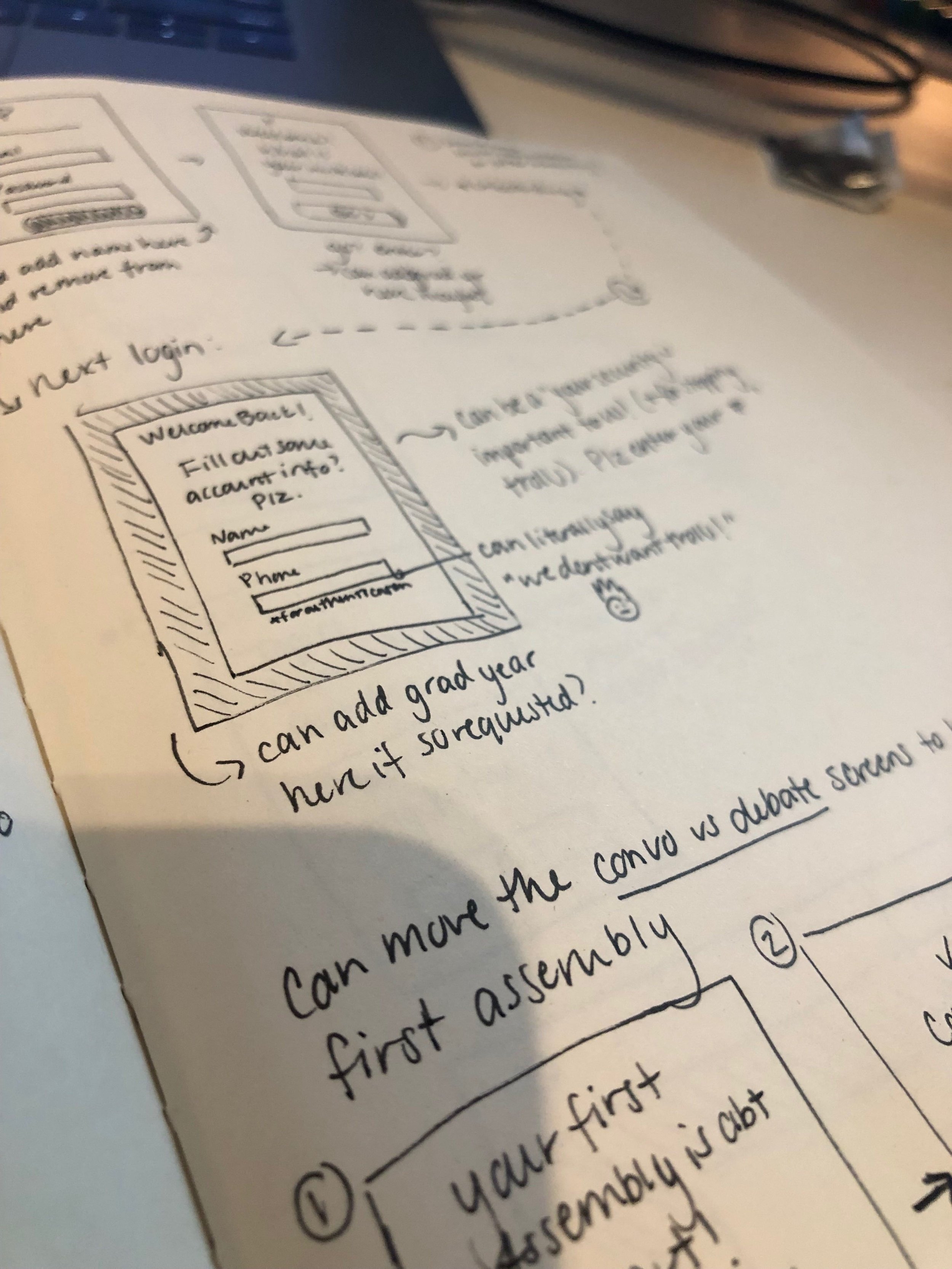
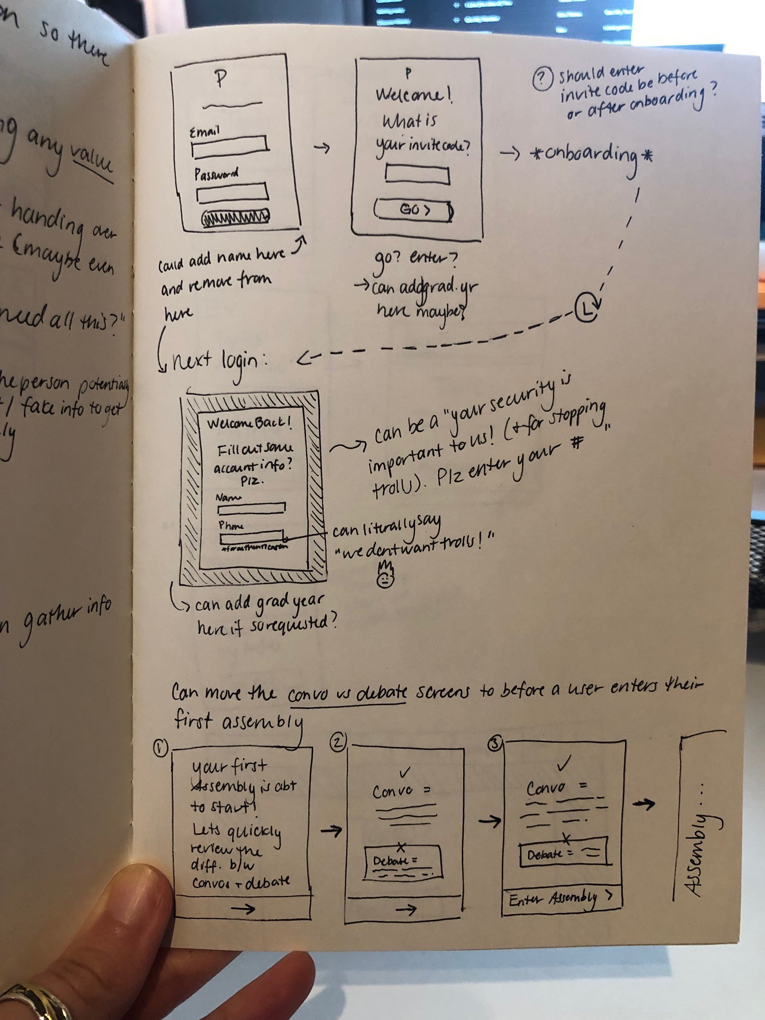
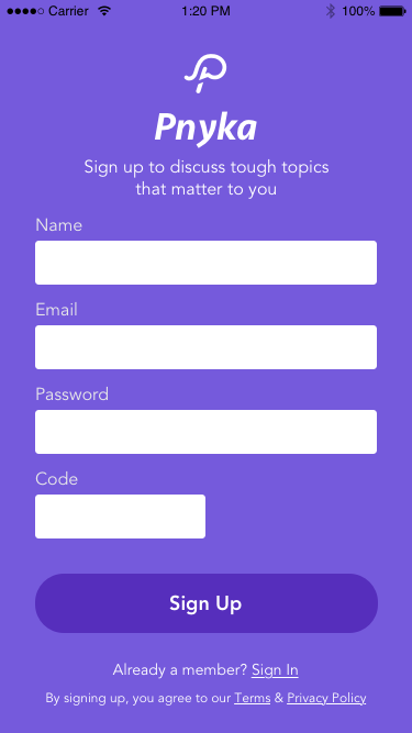
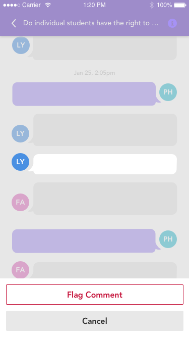
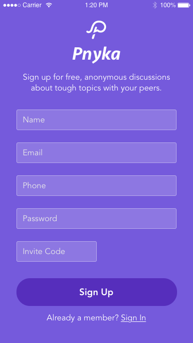
Sign up verification — the closed community aspect was crucial to our structure, as well as served as a main way to keep trolls out of our platform.
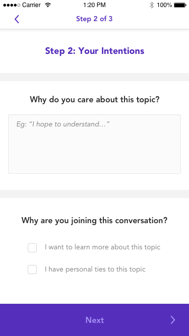
Onboarding — we knew the concept of our app and how it was structured would take some teaching. Onboarding was the best way to ensure every user enters with a baseline level of knowledge about the platform.
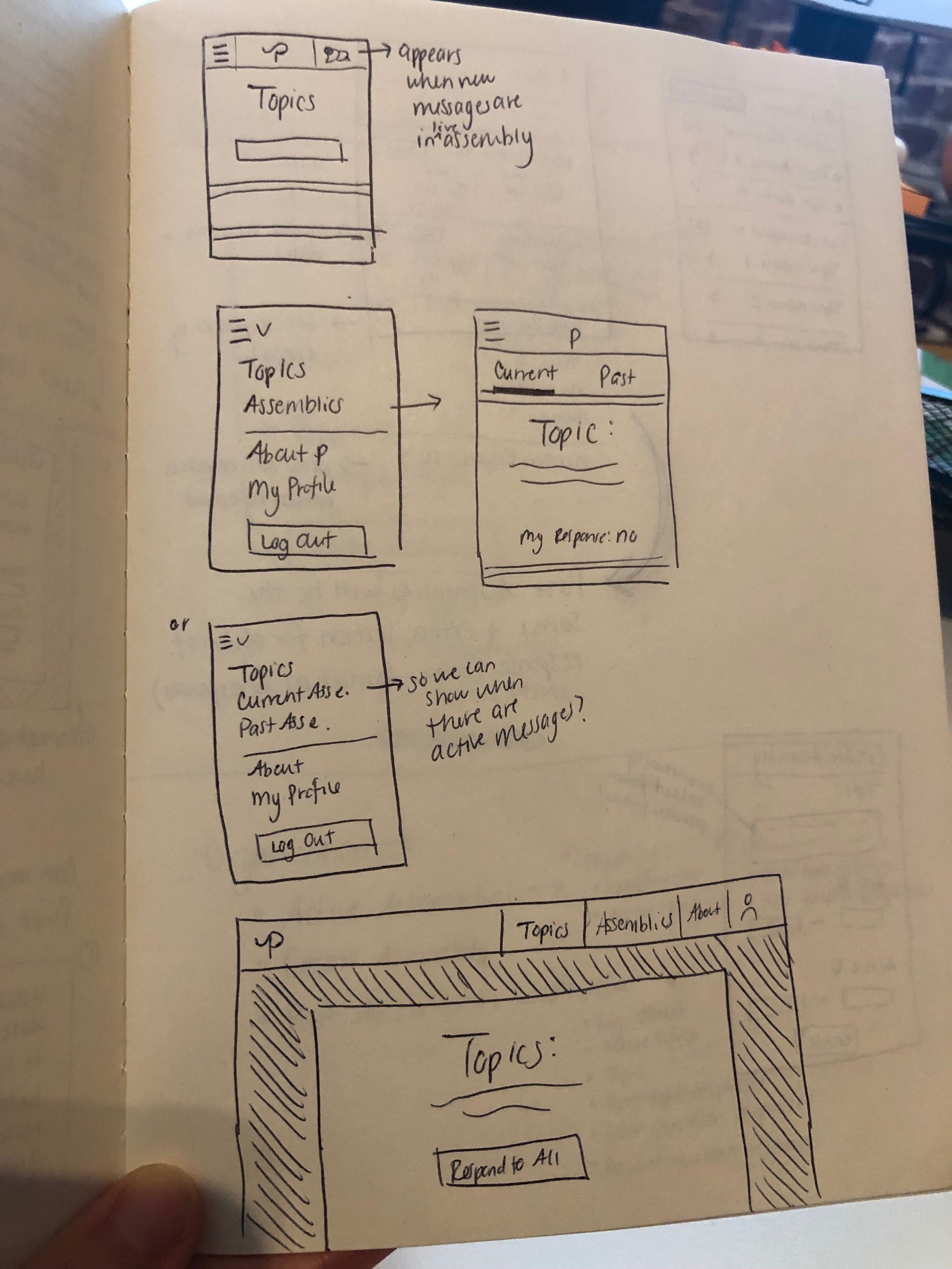
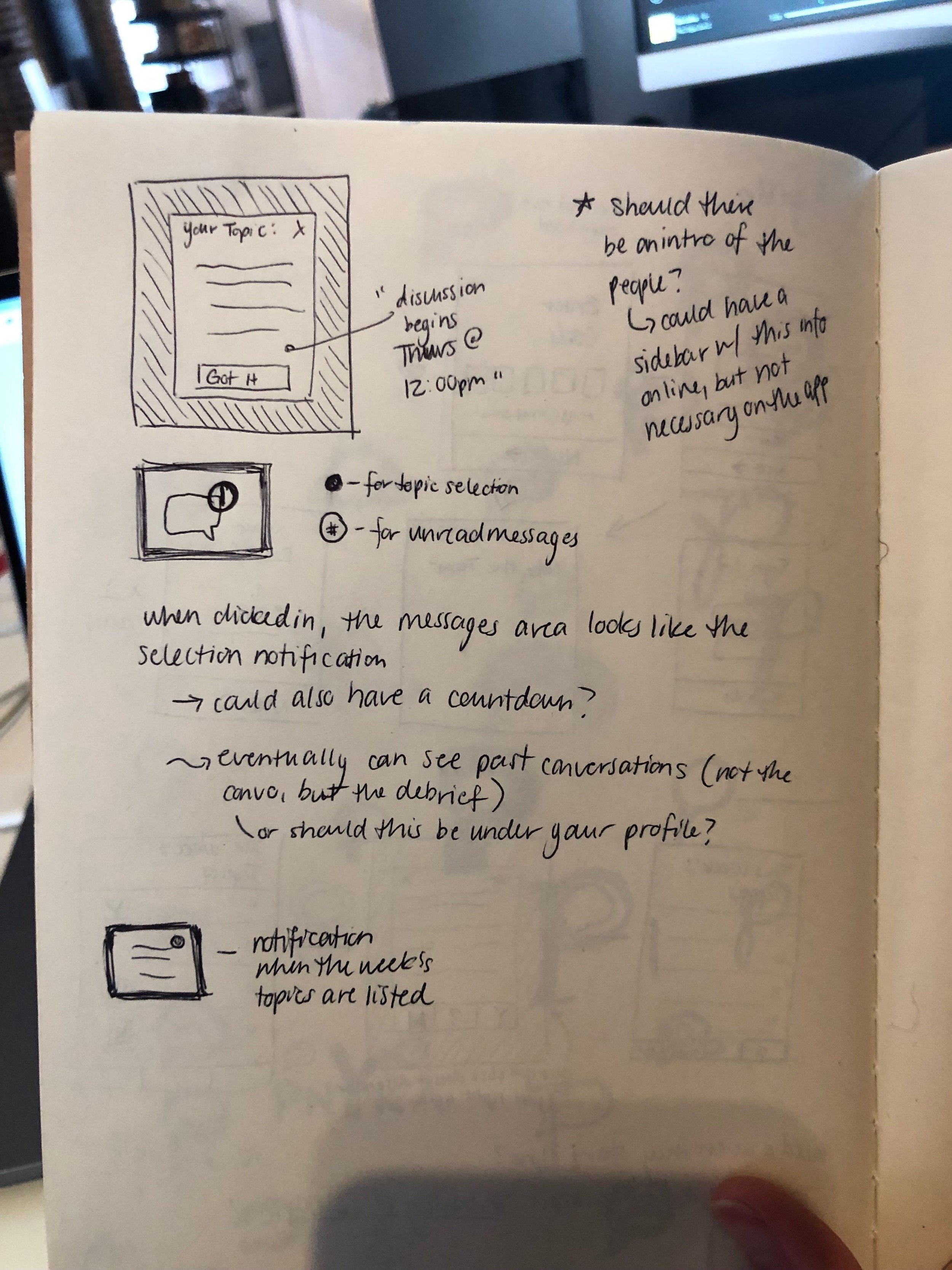
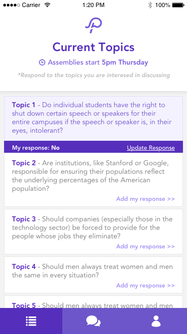
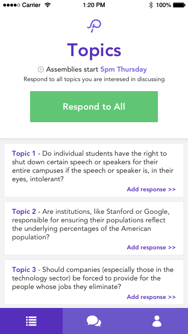
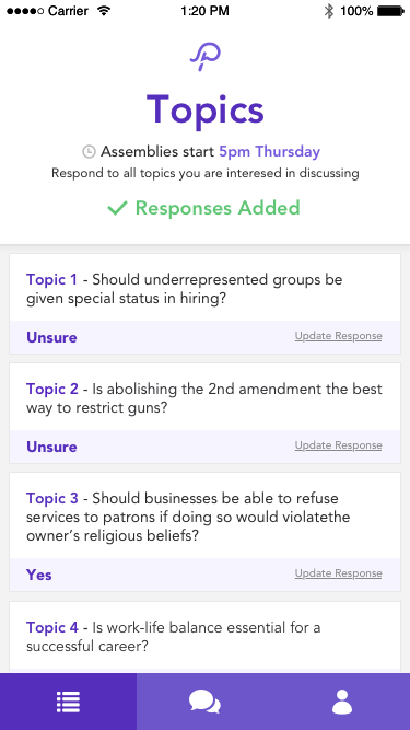
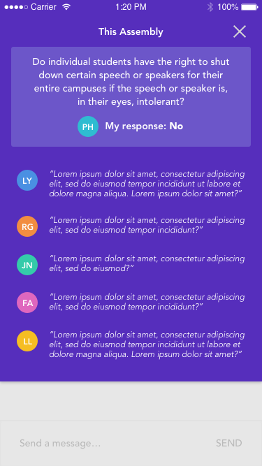
Viewing available topics — the user needed to see and understand a) which topics were available and b) when they would be discussed.
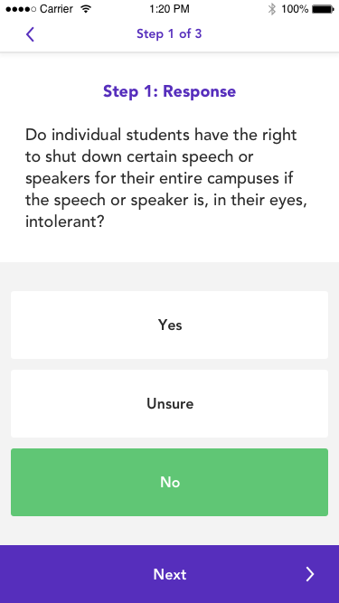
Responding to topics — we could only sort people into balanced discussion groups if we had users' responses to the topics, so this was a non-negotiable.
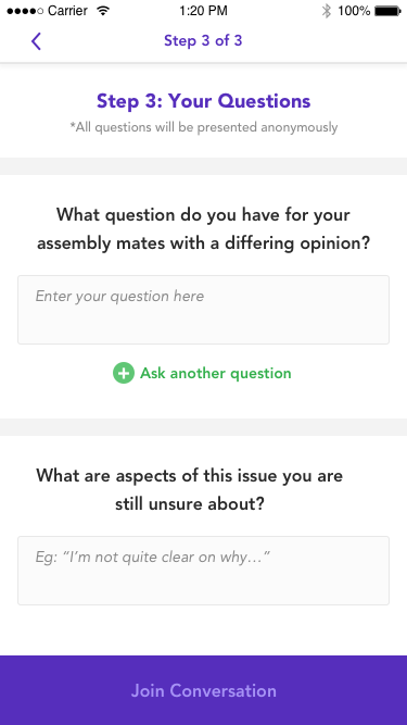
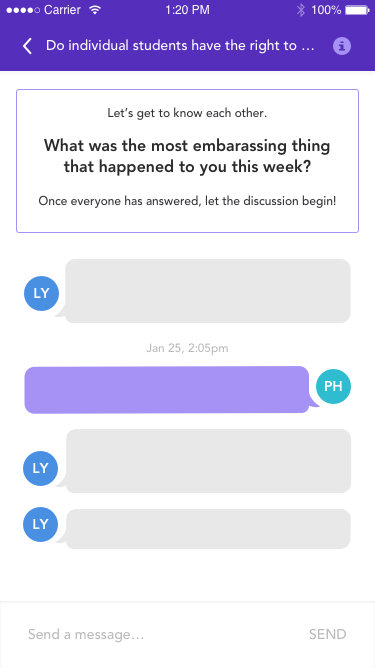
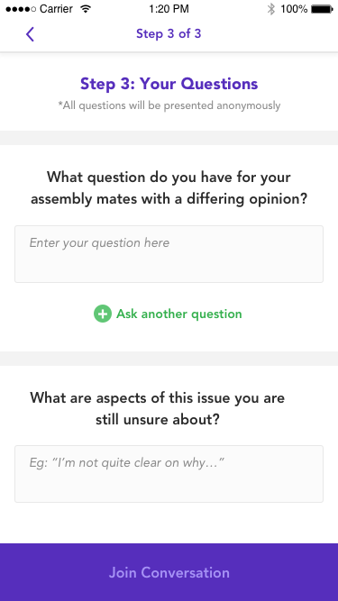
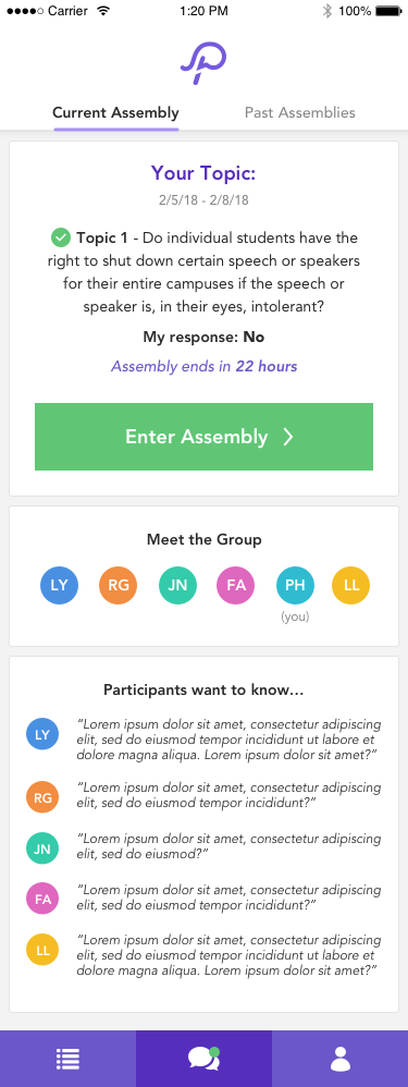
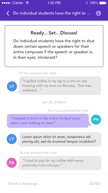
The Assembly* chat — this is where the magic happens, so it was of course needed!
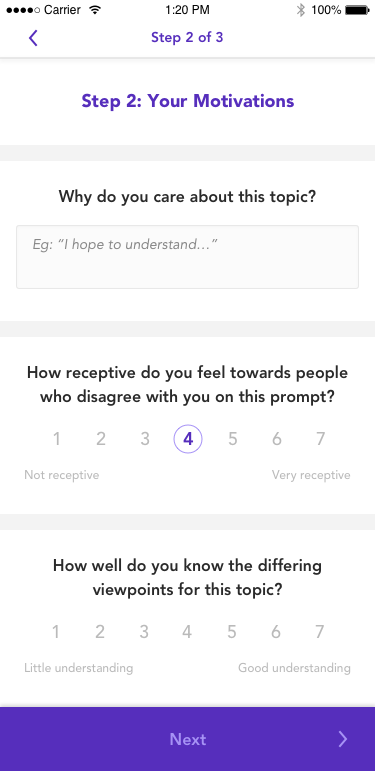
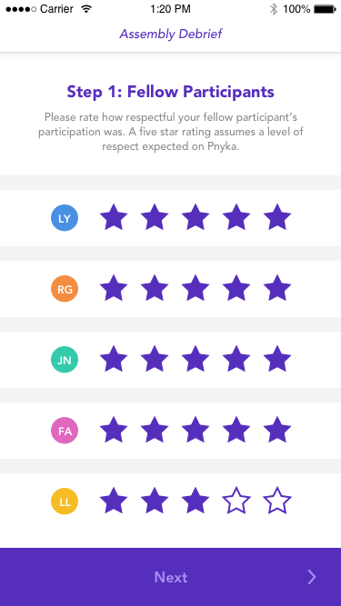
Debrief — while reflecting on your discussion experience was important, the most crucial element post-discussion was the ability to rate other users’ respectfulness levels. This was a core part of the behavioral psychology behind our platform that enforces respect.
(*Assemblies were the name for Pnyka’s discussion groups)
Though it felt like we made significant progress, I still felt like this was too much for an MVP. To get something out of the door, we needed to be more ruthless. I pushed us to go back and look at what we could take out — or at least slim down — from the above, and landed on the debrief section. I suggested that we use online survey tools to achieve proof of concept for this feature without significant engineering effort. After discussing this with our CTO, however, we decided that it was feasible to include this feature, so long as it used the same UI as the topic response.
Mapping & Prototypes
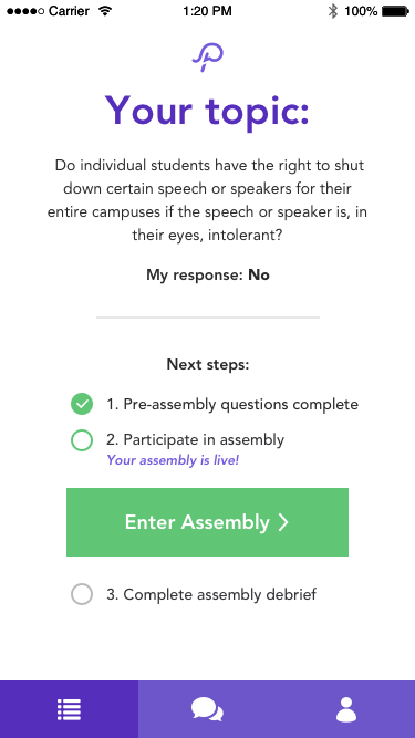
From the above, I mapped out the user journey and separated the features into the following 3 parts of the user flow:
Pre-Assembly
Assembly
Post-Assembly.
Breaking the flow into segments allowed the user to better understand what was asked of them at each point in the Assembly timeline, as well as reduce the up-front learning curve of our app’s structure.
Wireframes
Because I had already done work on Pnyka’s brand identity, I expedited the process to see how the agreed upon prototypes might look and feel. I tried to keep the interface simple to make sure the content was the star of the show.
Keeping the interface clean also would help us guide the user through the process by allowing colored text to catch the users eye and indicate important information.

MVP Designs
Once I received feedback from the team, cofounders, and advisors on the high fidelity wireframes + Invision flows, I went through additional iteration cycles to scrape off a few features that we could get buy without.
Once I received buy-in, I created a product requirements doc and passed along the designs to our development team to bring our vision to life!
Reflection
Looking back, I believe I could have focused more on creating an interface that worked on both mobile AND desktop from the get-go. I focused on mobile first — navigation on bottom, focus on vertical screen real estate — which made for a slightly clunky experience on desktop.
Once we had the MVP out and did a large Craigslist user test, we found out that users were split almost exactly 50/50 on using our platform on mobile vs desktop. This meant that I needed to spend some time focusing on improvements to the desktop experience. After initial competitive research and ideation, I decided that moving the navigation to a top bar/hamburger menu combo would make the experience much more seamless on both screens (until we could create a native app).
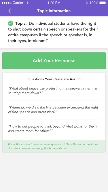
Another area of confusion we found during testing was the “waiting room” aspect. We created this one level deep screen from clicking on “add response” so that we could include information about that topic (questions other users had asked, links, etc). However, this relied too heavily on user-generated content, making the screen confusing when you enter if nothing was there. Conversely, when there was a fair amount of content there, it distracted the user from the primary task at hand (responding to the topic). Because of these findings, we decided to remove this screen and test having users go directly into the response flow upon clicking “add response”. The hope here was to lead users through the path of responding to all topics they find interesting without disrupting the flow and giving them a chance to get distracted.

During testing, the most requested features were chat features users were familiar with (think: replying to comments/users, reactions). We tried to really think through why users missed these features so desperately. When diving deeper with users, it was clear that, on top of it being a familiar convention with interacting with others in an online chat, users wanted features like replying to a user or thread because it helped them have a more natural conversation. Without these features, the chats would become busy and confusing with people talking over each other or having to add extra effort into their response to point out whom or to which comment they were referring. This caused frustration - which is not what you want!
For the reactions aspect, we conducted and used a lot of research from our partners to inform what kinds of reactions would be PRODUCTIVE to conversations, rather than perpetuating the polarization, disrespect, and hate we see today. We wanted these conversations to be challenging, but safe.
