
highlights
Course Hero - 2023 - 2024
Overview
Team: 1 PMs, 1 product designer (me), 1 full-stack developer
Timeline: 3 weeks for research & design, 2 for implementation, 1 month to test, ‘fast-follow” wiggle room
Users: Basic & Premier users
Context

the problem: documents are cumbersome and information is widely dispersed.
unpacking The problem
To put it bluntly, our experience was flat; we did not provide a way for users to use the helpful information they were finding on Course Hero. There were three main pieces we found surrounding this problem:
Documents are cumbersome and not easily scannable (source: Fullstory)
There is no way to revisit useful information on Course Hero (source: user interviews)
There is no perceived value from our dashboard, leading to minimal usage (source: Amplitude data, user interviews)
We would often see users scroll past the information they were looking for in Fullstory, or rage-click when they couldn’t find the information promised [by Google’s search pull or the document summary]. While we did have search functionality, it was sparsely used and added an extra step to finding the information you were looking for.
Outside of bookmarking, which only 8% found useful, we provided no easy way for users to revisit pieces of information they deemed valuable. We saw from research that users would unlock multiple documents in order to find a few pieces of information they needed. Most users deemed the rest of the document superfluous.
All viewed documents were dumped onto a dashboard with sloppy filtering and no way to indicate useful documents or information, meaning often useful things would get lost in the pile over time. Additionally, users were unable to customize their experience. One example where this is an issue is that our platform is user-generated, meaning there are often duplicates of courses. Our dashboard filtering system was based on these courses, meaning if a student bookmarked documents from two or more similar courses (or even a completely different course that touched on a relevant topic), they wouldn’t show together on the dashboard, even though the student was using them to study for one particular course. There was no way for the user to dictate how and where information was saved.
synthesizing findings
After a brainstorm with the team, we found that users want to:
Extract:
Extract useful information from Course Hero documents
Use:
Consolidate their collected information to study
Revisit:
Find all of their course information in one place
Ideation
After the brainstorm, I jumped into ideation mode.
After my explorations, I landed on three solution suggestions to address each of the issues at hand:

UXR & Plan

Our next step was to conduct UXR on rough wireframes that outlined the solution ideas I presented. We knew ideas we had to address all the underlying user problems were too large and out of scope for an MVP, so we needed user input in order to map out a plan.
We looked to get a quick pulse on what was resonating with users, and what felt most pertinent to them during their study journey in order to make these decisions.
After the research and meeting with the engineers, we were able to map out the following rollout plan:
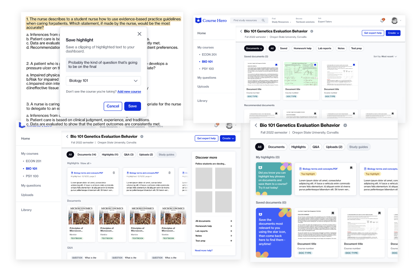
Phase 1 (MVP): Highlights
Phase 2 (V1): Personal course folders
Phase 3 (Future): Flashcards and study guides
V1 coming to life
Generally, the way I design is to produce a blue sky version, then scale it back to be built and tested along the way (before too much dev investment has gone into it). This gives us a path forward, so I don’t design us into a corner, but also allows us to validate the feature(s) as they grow and expand.

After discussions with the dev team as to what pieces of my blue-sky version would take the most time, we landed on an MVP.
Because the side rail of saved highlights on each document would be too much work, we scaled back by adding the number of highlights next to the button to ensure 2 things: 1) so that users would know when they have highlights that exist on the page, and 2) so that users get a visual confirmation that their highlight was captured successfully.
The second way we scaled back was to add a swimlane for highlights on the dashboard instead of going all-in on course folders, which we did for a few reasons. To start, even if we added course folders to the site, the only useful aspect of them at that point in time would be for a user to find their saved highlights and notes. We didn’t think this one feature alone would be compelling enough for the users to warrant their own page.
Putting them directly on the dashboard also had some pros, including the fact that users could always find their highlights in one aggregated place, which could be sorted by course (in addition to being able to view them directly on the documents). Additionally, by tagging their saved highlights to a course, we were also training the user on the concept of saving useful elements to a specific place. This allowed us to use the metadata from each highlight to put them in the appropriate course folders down the line. A win-win!

launch results

Unfortunately, the total active users were lower than we had hoped in the first 6 weeks, though the number of highlights per user was quite high. This showed us that the feature was useful, but we had a top-of-funnel problem. We weren’t doing a good enough job, either with discoverability or communicating the value of the feature.
Quick improvements
To address this, we made two modifications to the highlight mode:
Updating onboarding GIF to actual footage of the feature to make the interaction more clear
Updating the mode banners to be more clear + provide education about the feature; moved them to top of document to be more apparent
Onboarding tooltip that appears the first time you enter highlight mode

Banner that appears when youre in highlight mode
reflection
I was so proud at what our small team accomplished in such a short amount of time.
Though we did a lot of things well, there was still a lot our team wanted learn and reflect on:
Did we think deeply enough about onboarding and discoverability? Especially considering the low stats?
How could we have made it clear that annotation aspect is a part of of this feature from the top-level? (UXR found it was a highly desirable feature)
Should we look into other ways to extract information from documents? Is there a more natural path for students?
How do we continue to promote regular engagement of this feature? Are we missing any user needs?
Follow-up & Evolution
Because of the adoption being lower than we had hoped, we decided to try out a new route. We wanted to make the document actions as a whole more front and center, as well as take the opportunity to make them more consistent – because.
To do this, we decided to combine all possible document actions into one interaction - selecting text. There were two ways to do this, which we A/B tested. One where you select the action you want to take first, then select the text, the other where you select text first, then select the action after from a floating toolbar. Though the second is preferred and was assumed to be more natural, the front and center nature of the action selection first made it win out.

Results

Huge improvement!!
further Improvements & integration
Chat was an additional tool that was added to the toolbar during this time (humble brag: I was also in charge of this feature). We wanted all document tools to feel integrated, as well as bring additional discovery opportunities to our tool. To do this, we determined specific types of documents & interactions where we could predict what would be most helpful to the user. We wanted to get the right tools to the user at the right time!
Results are TBD! Currently being tracked now