
Chat features
Pnyka — 2019
We finally reached the point where the MVP was running smoothly, which meant it was the time to dig into ways we could further differentiate ourselves. A big area we knew we were lacking was in the chat features department. From testing I had conducted, users were confused as to why they couldn’t do things on our app that they could on other chat platforms — things such as replying to users and reacting to comments.
What to address first?
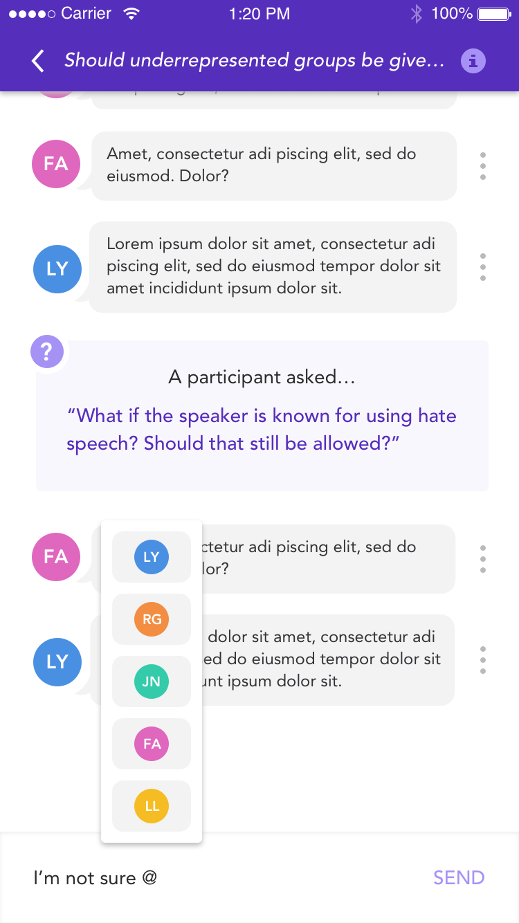
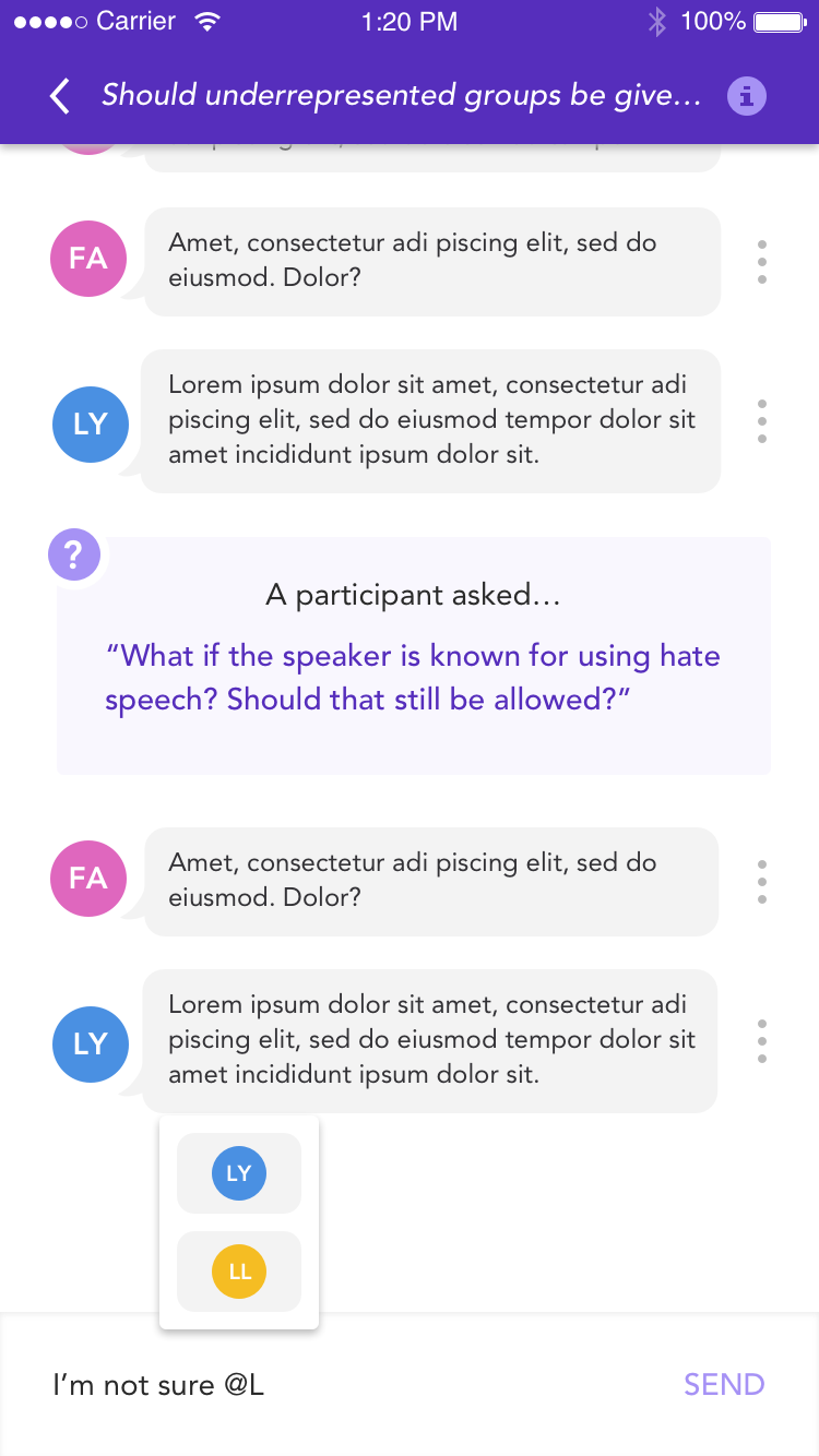
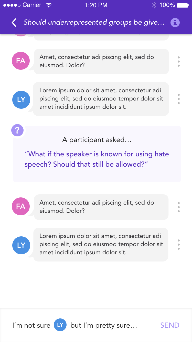
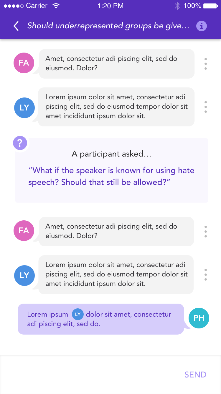
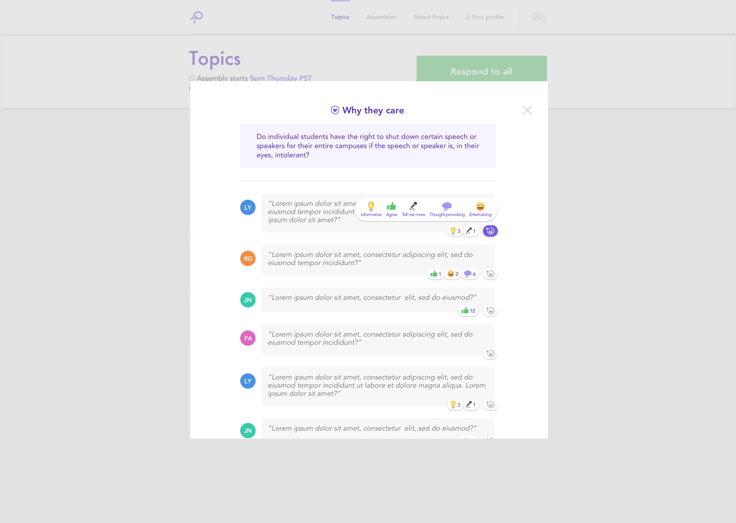
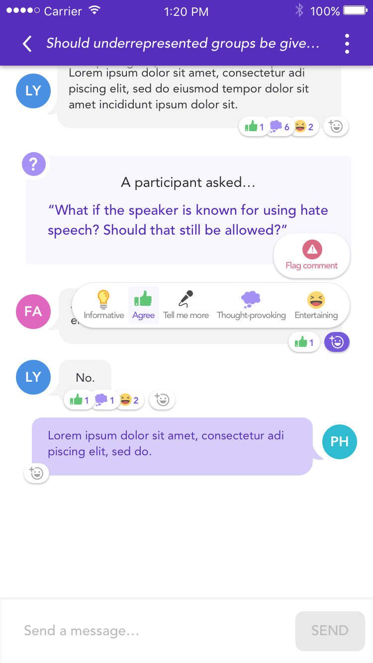
The primary concern we heard from user testing was that users wanted to be able to reply to specific users. I wanted to make sure this wasn’t simply users wanting the same sort of “threading” experience they would have on other sites, but upon needling into this concern I found a legitimate concern. Since our Assembly discussions were 6-8 people, users had difficulty responding to specific users or comments because they would get buried (particularly in anonymous Assemblies, where icons were used as opposed to initials). This made engaged users incredibly frustrated. They wanted to have a thorough conversation, but our current flat-chat structure didn’t set them up for success on our platform. This made replying to users first priority.
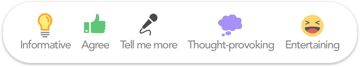
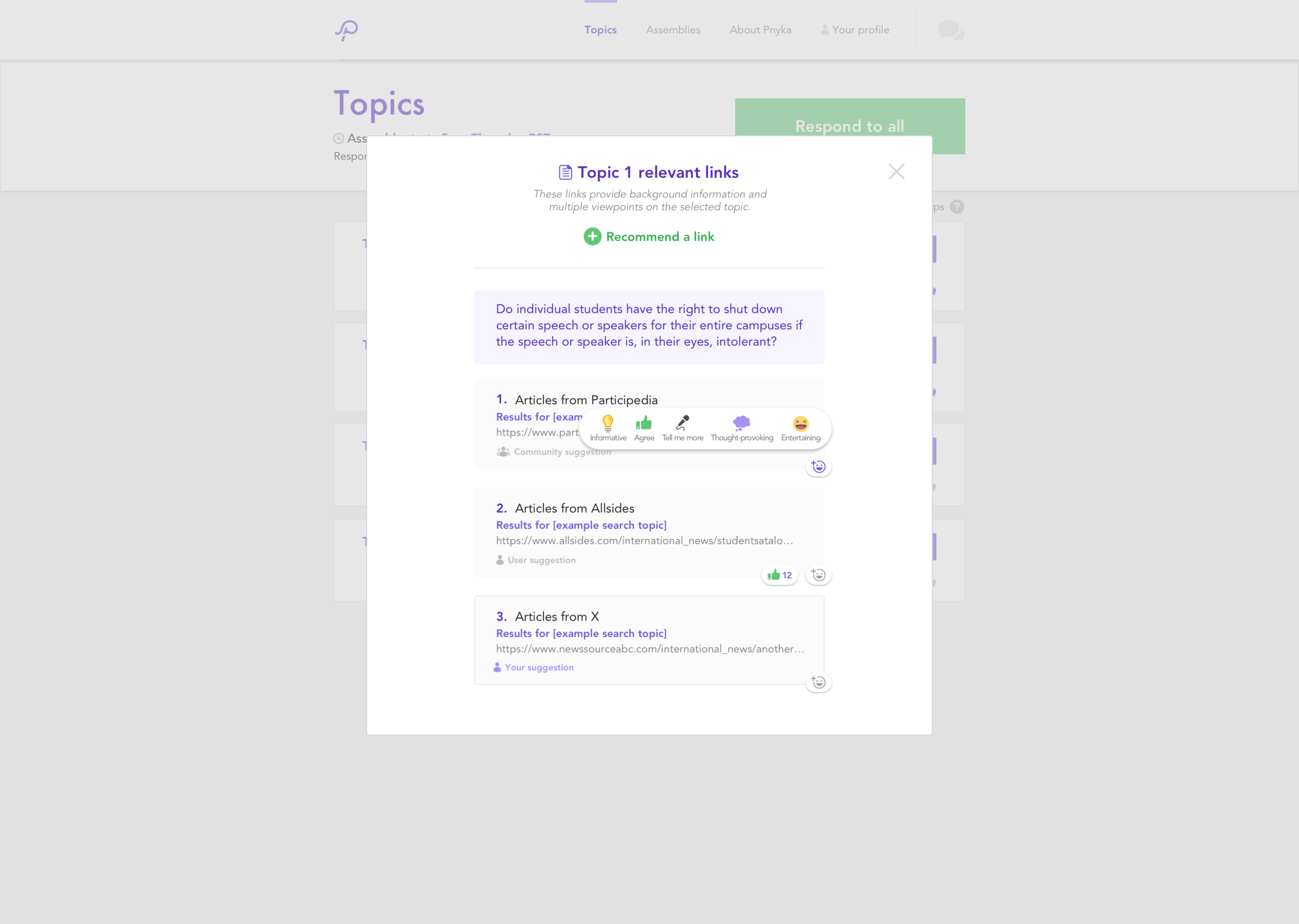
The next aspect we wanted to address was reactions. Emojis and reacting to messages/comments has become commonplace in online discourse. Using research and studies from our partners, we narrowed down the options to reactions that would encourage respect or further the conversation: informative, agree, thought provoking, tell me more, and entertaining.
UI & Graphic Play
A big aspect of our app was that our conversations are semi or fully anonymous (at the discretion of the community leader). This makes it a bit of a challenge. I decide the easiest way to do this is to have all user bubble options come up when you “@”. Whether it’s initials or Greek icons, each user has a different color bubble, meaning there are two ways to indicate to the user that they are replying to the correct person. After testing it, we were relieved to find that the feature was a) easy to find and b) easy to use.
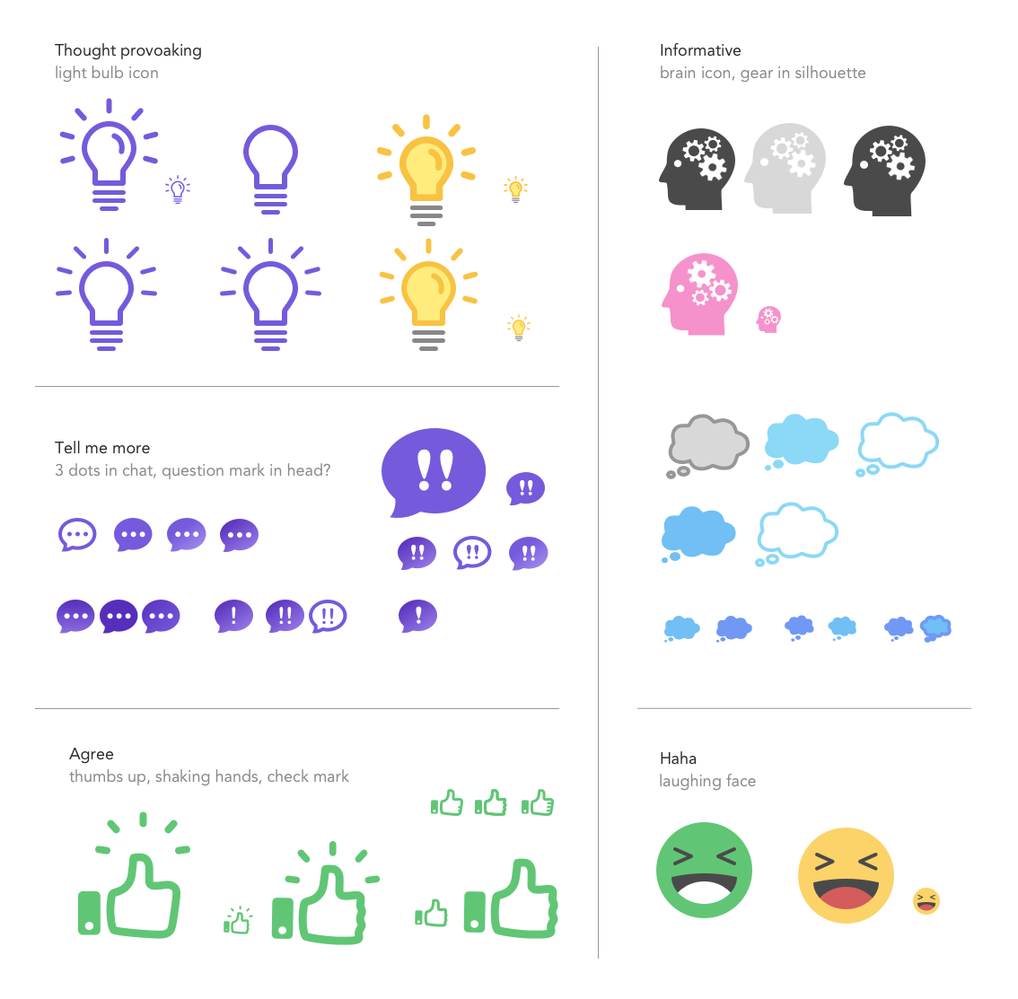
Reactions were a bit more challenging. How do you convey an entire sentiment in one tiny icon? It was fun to flex my creative brain in this more visually heavy capacity…but I definitely went through a lot of iterations!
While sentiments like “agree” and “entertaining” already had conventions around them, things like “tell me more” and “informative” were more difficult.
After testing out a few ideas with the team and our network we finally landed in a good place. You can see the final version of our custom reactions below!
Reflection
Looking back, I think that I could have done a better job of looking into ways of making online discussions involving multiple users better. We have all had that friend or family group chat that spirals out of control because everyone is talking at once. What measures could we have put in place to prevent this “shouting into the void” feeling? How could we have displayed comments better so that they weren’t so overwhelming? How do we deal with the problem of a user needing to “catch up” on messages others had sent while they stepped away from the app? These are all things I wish I had asked earlier.
Though we had research backing up our decision on what to make our reactions, I wish we had cross-referenced them with other research from big players (like Facebook, for instance). We came to understand that “entertaining” could be used in a negative way. Other platforms had started to realize that “entertaining” was used to make fun of other users, laughing at things that weren’t meant to be funny or light-hearted. This led us to reconsider the use of this particular reaction.