![Topics mobile (with topic feature icons) [fit]@2x.png](https://images.squarespace-cdn.com/content/v1/5709b52e7c65e49ce610959a/1560215613592-TR93XBURE1ZZL01WGAPI/Topics+mobile+%28with+topic+feature+icons%29+%5Bfit%5D%402x.png)
Waiting Room
Pnyka — 2018
Once the MVP product of Pnyka was launched, we closely monitored user’s journeys to pinpoint issues with the app and user flow. The greatest area we uncovered issues within was the time in between a user signing up and a user participating in a discussion. While time in app wasn’t our primary concern (we wanted to prioritize quality over quantity), we did see this as an opportunity to capitalize on one of our platform’s goals: furthering learning and understanding through the perspectives of those who think differently.
Defining the problem
What we found
Lag time between signup and discussion caused user drop-off
Users often felt unprepared on the topic when entering the discussion
Though we did a good job of getting users to sign up for discussions, getting them back on the platform to participate on the discussions was an issue. We needled into why this was happening for users and we learned that users would flat out forget about the discussion. The app at this point wasn’t native, so we only had SMS notifications that most users would turn off from the beginning. As we were still doing research on the best cadence for Assembly discussions (that would hopefully create habitual use), we needed another reason for users to come back.
Another major issue we uncovered was that users felt unprepared about the topics. They usually were deep issues with a lot of moving parts, and users didn’t feel they didn’t have enough information to participate in a full on discussion surrounding these topics. Further, this created a divide between those who were experts on the topic and those that simply cared and wanted to learn more.
Our goal
Increase the number of users that signed up coming back for their designated discussion.
How we measured success:
% of users who sign up for a discussion that return and participate in their discussion.
Secondary metrics:
Defining “sign up” (signs up for 1+ topic)
Defining participation (sends 1+ message)
Additional: tracking avg # messages sent and avg length of message (hypothesis being increased messages and length indicate more involved discussion experience)
Brainstorming potential solutions
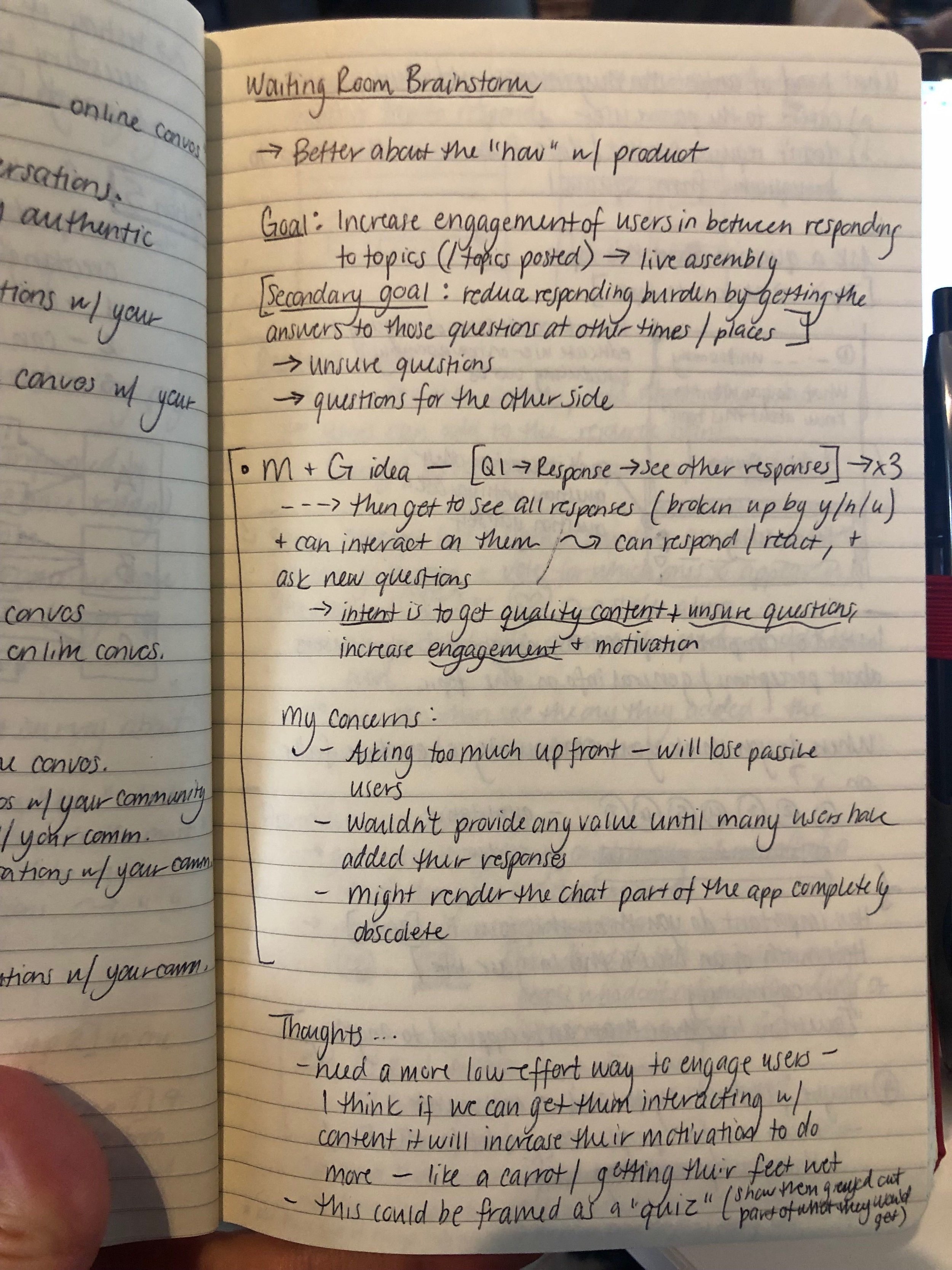
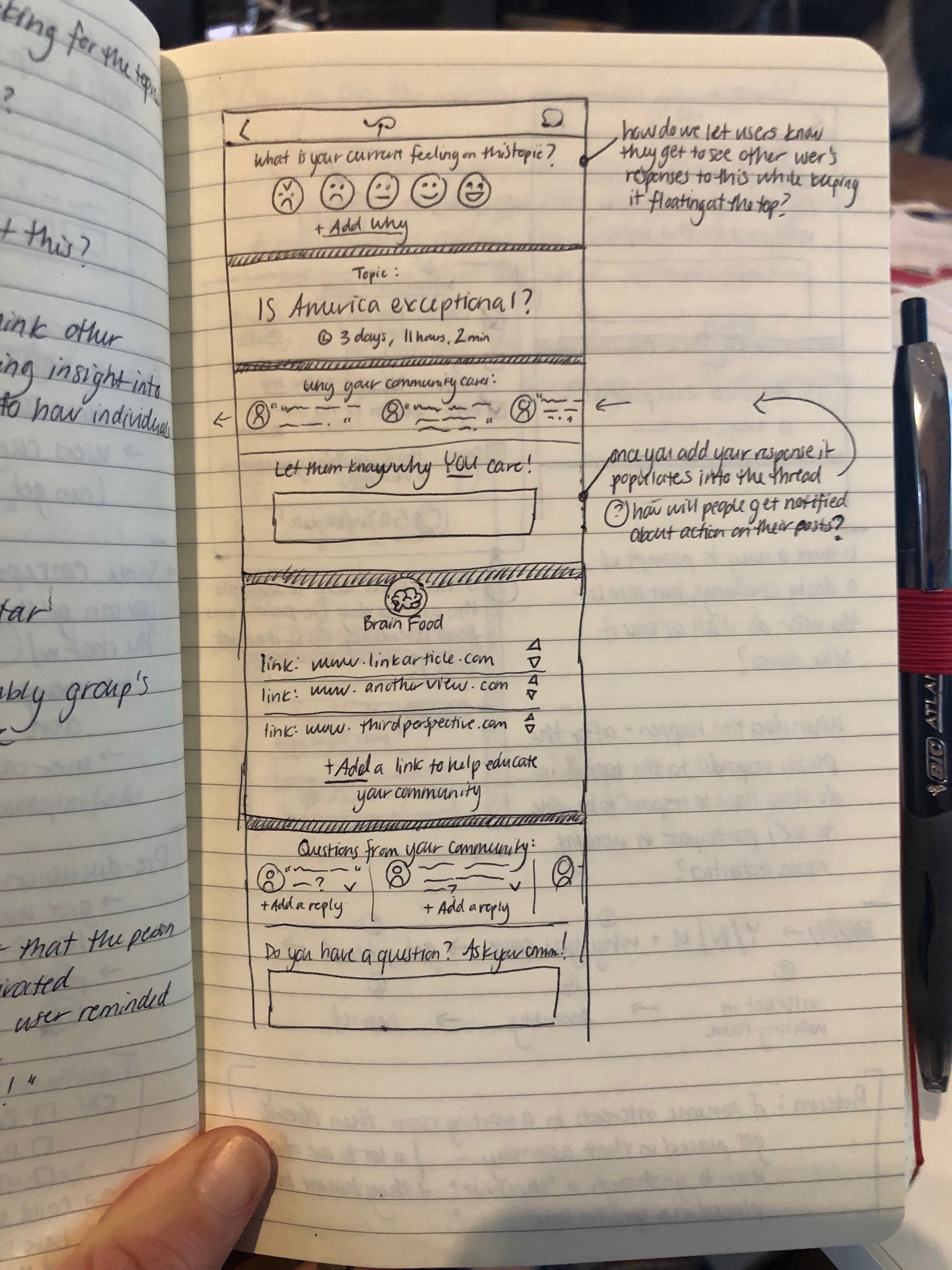
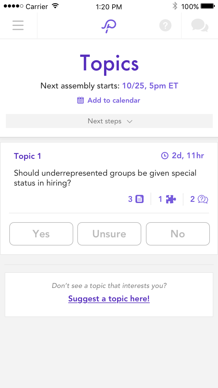
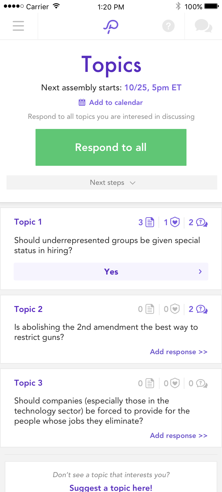
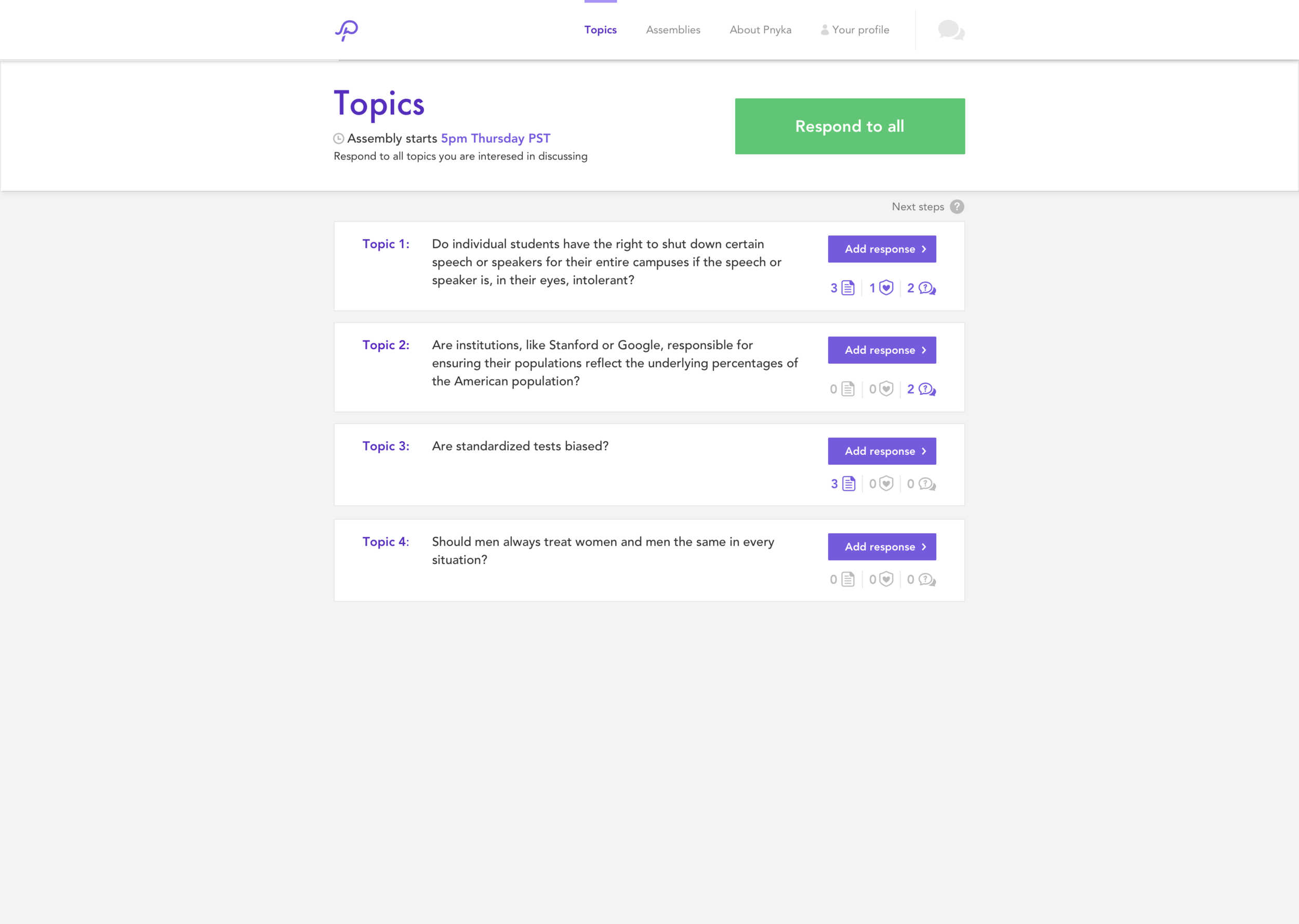
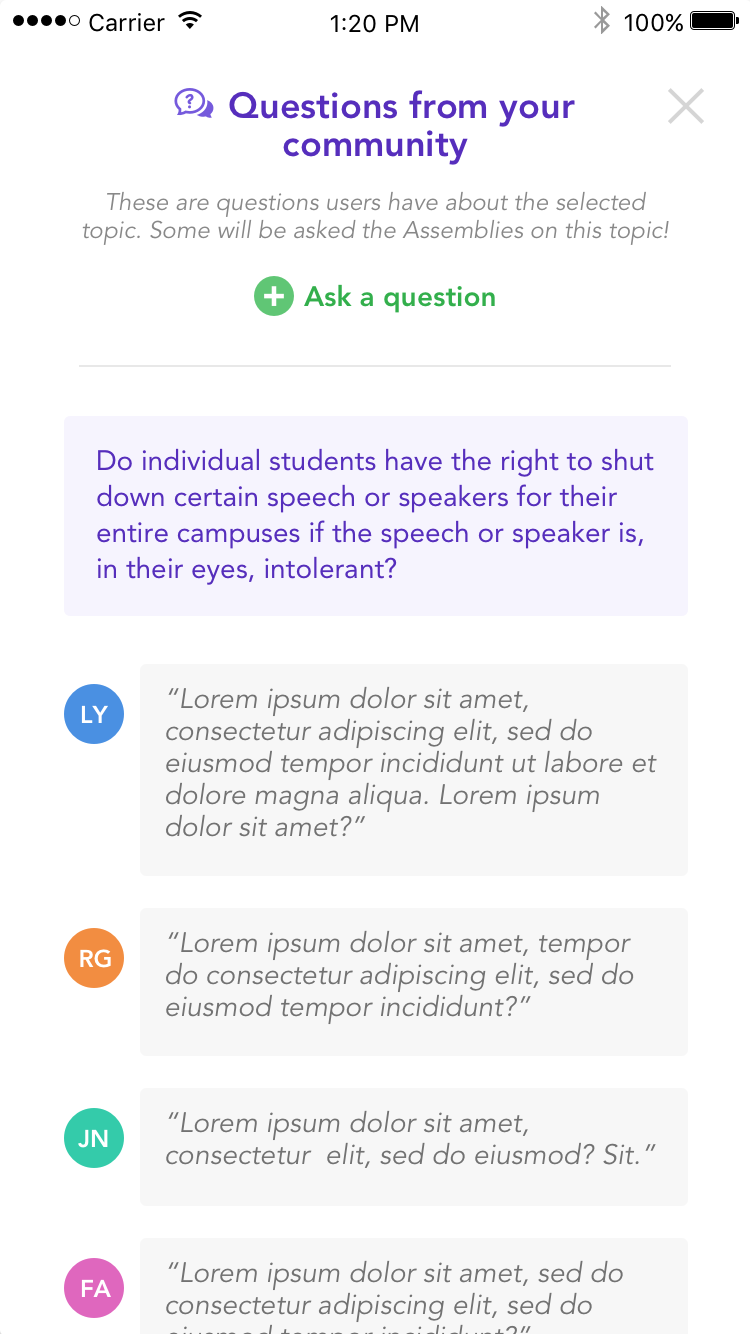
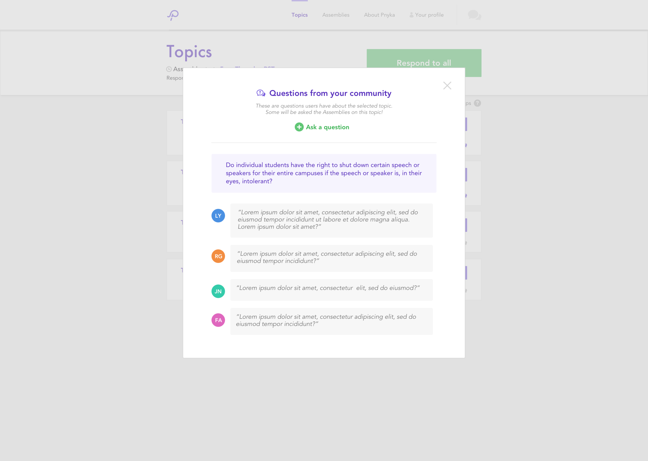
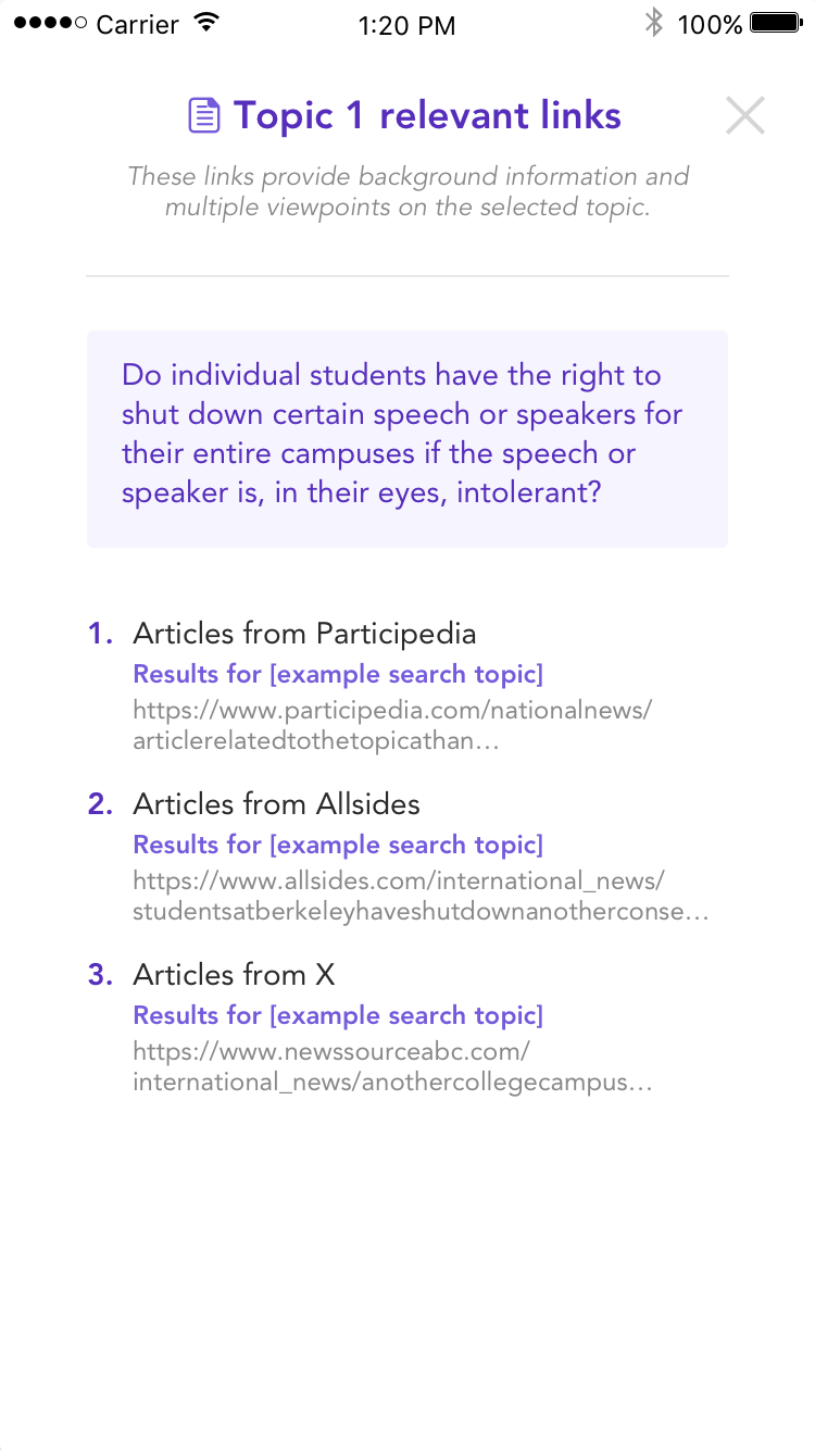
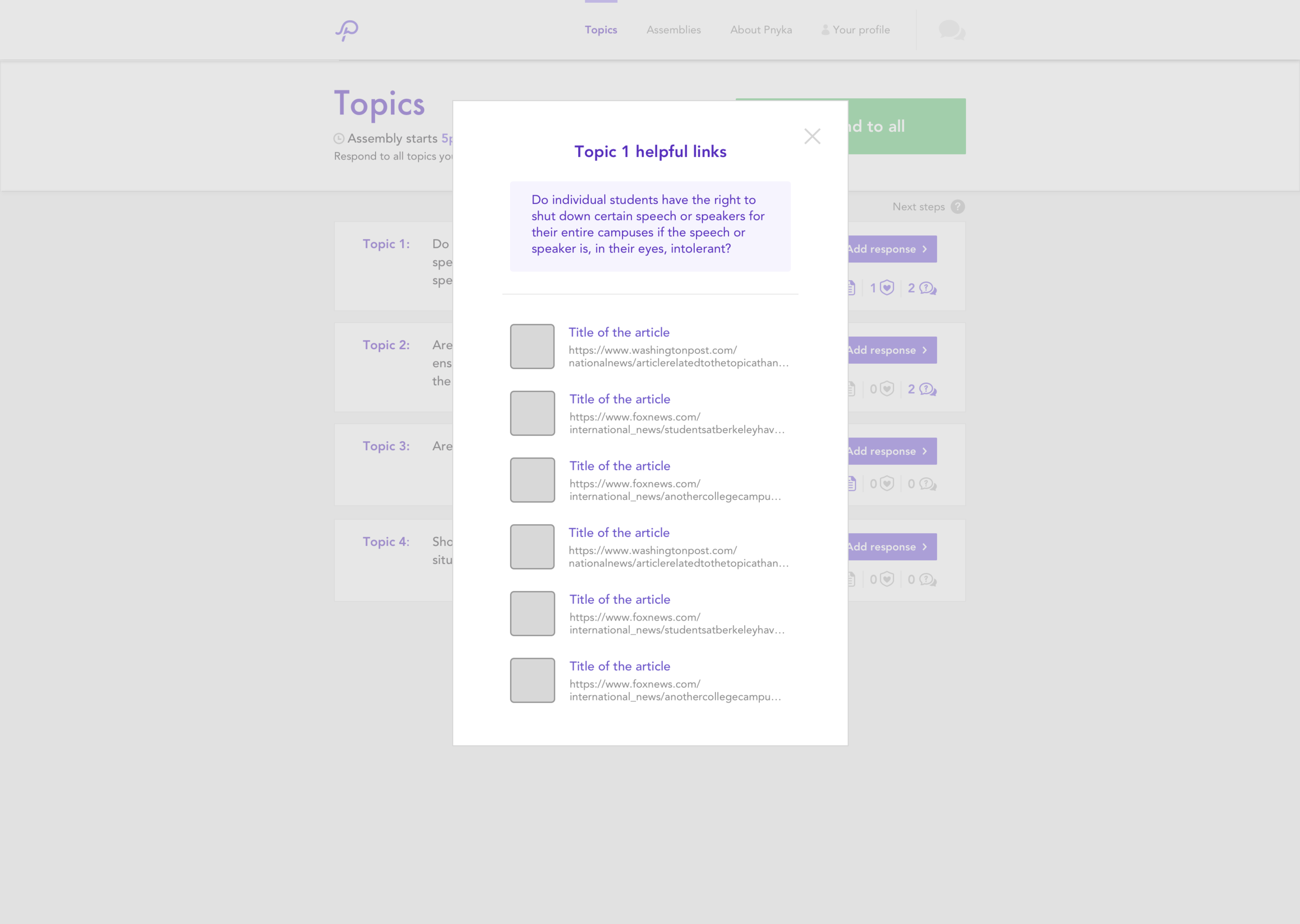
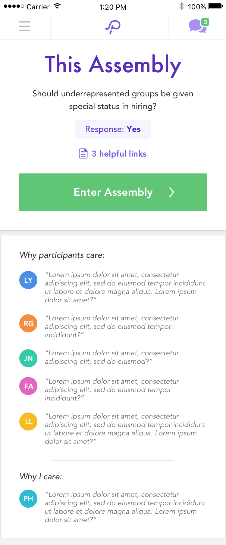
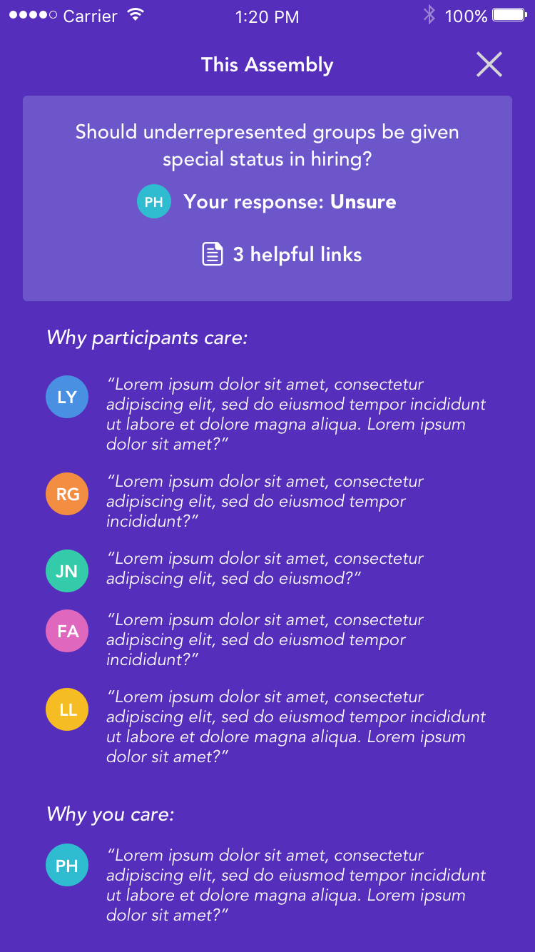
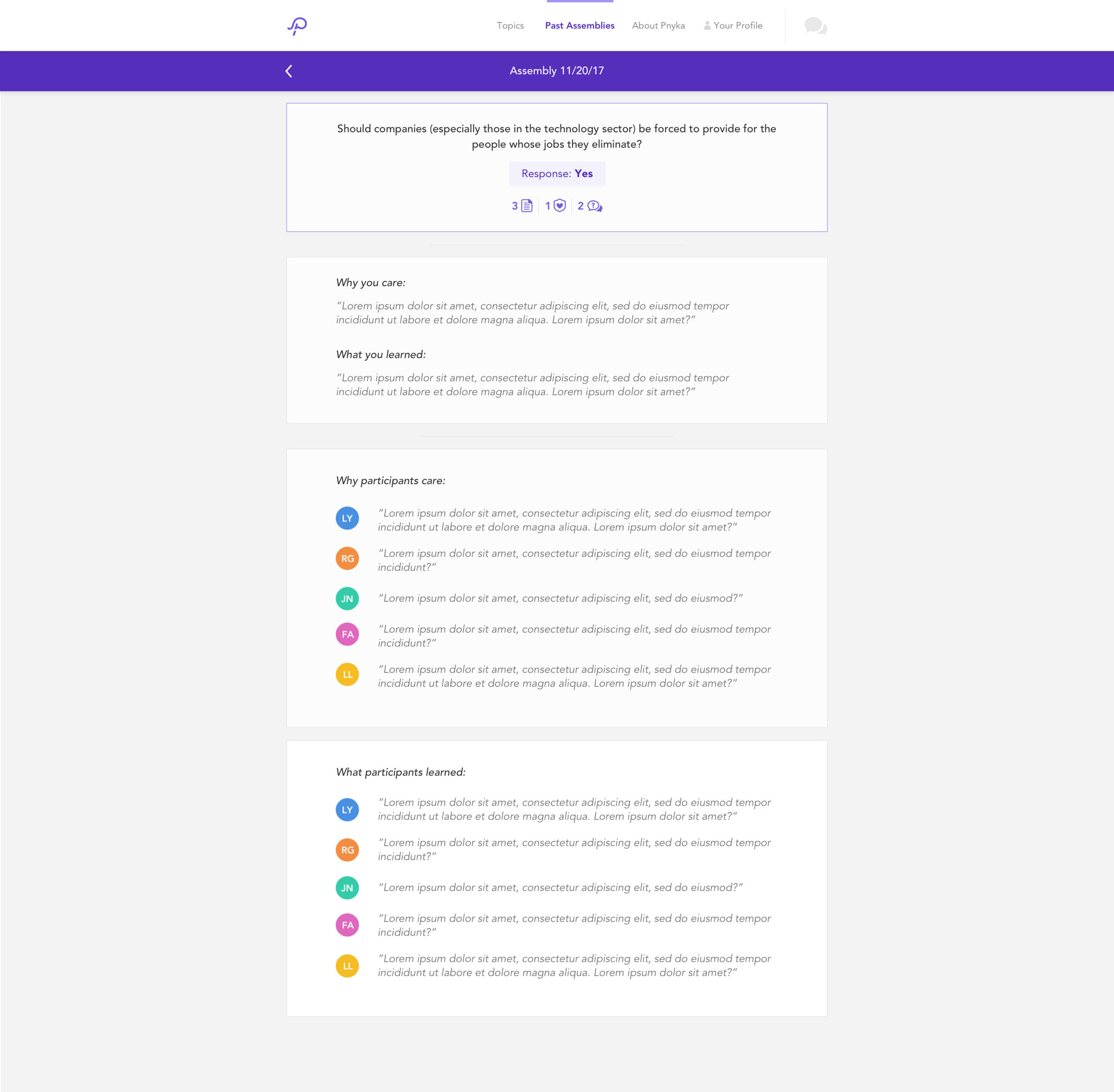
After gathering the team together for a brainstorm, we landed on a concept that may help: a waiting room. Each topic could have its own waiting room where we could house relevant links, questions about the topic from users, why people care, etc. This could have many benefits for us, including:
Giving users something to interact with in the downtime between signing up and the discussions
Helping educate users on various aspects of the topic
Thinking more deeply about the topic from reading questions others have on the topic
Humanizing views from those with differing options from user generated questions and “I care” statements
….just to name a few.
Ideation & Testing
From our initial brainstorm, we narrowed it down to a few ideas we wanted to test that we thought could achieve the goals outlined above.
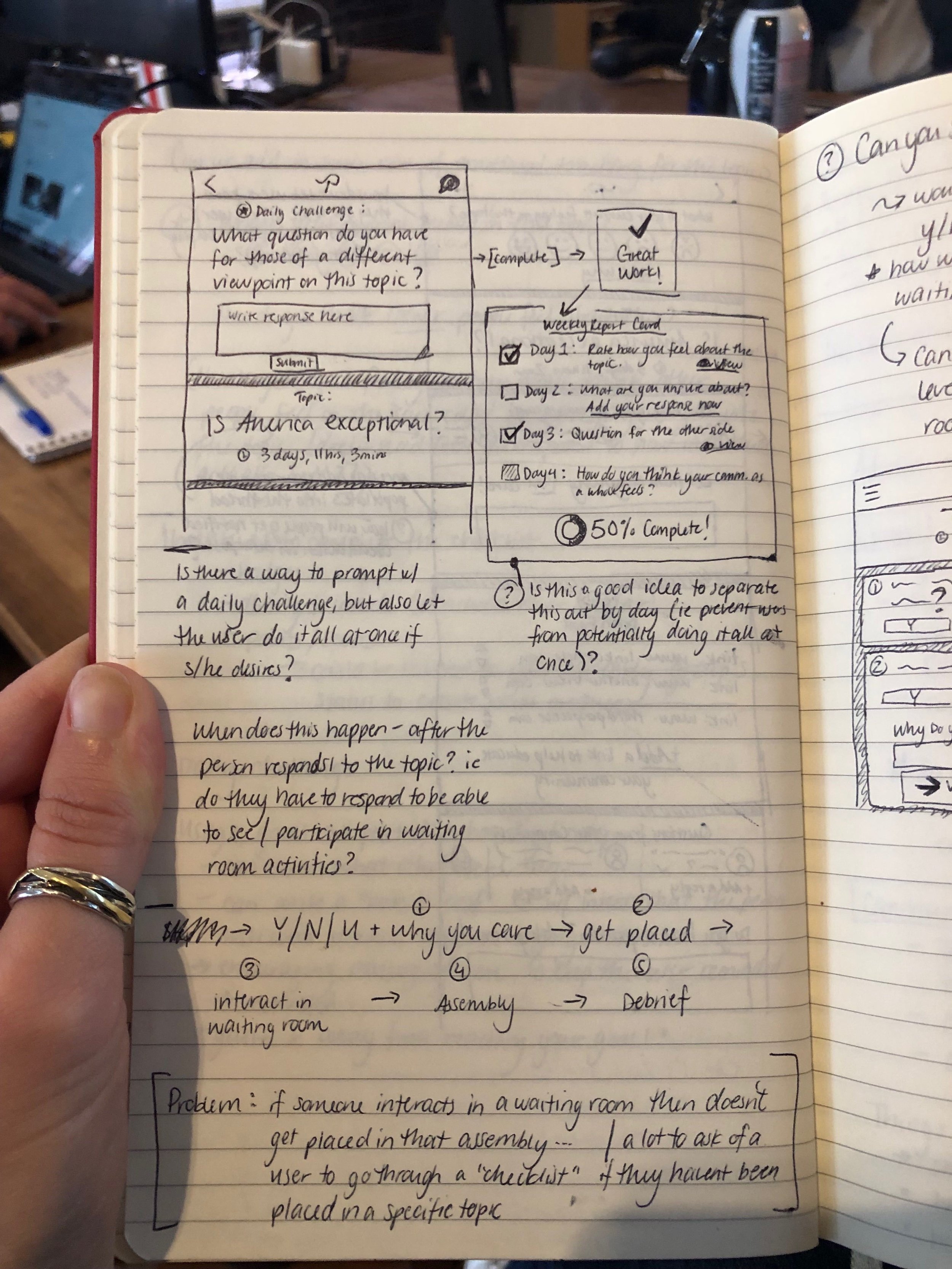
Checklist/Assembly progress report
Quizzes
Goal setting
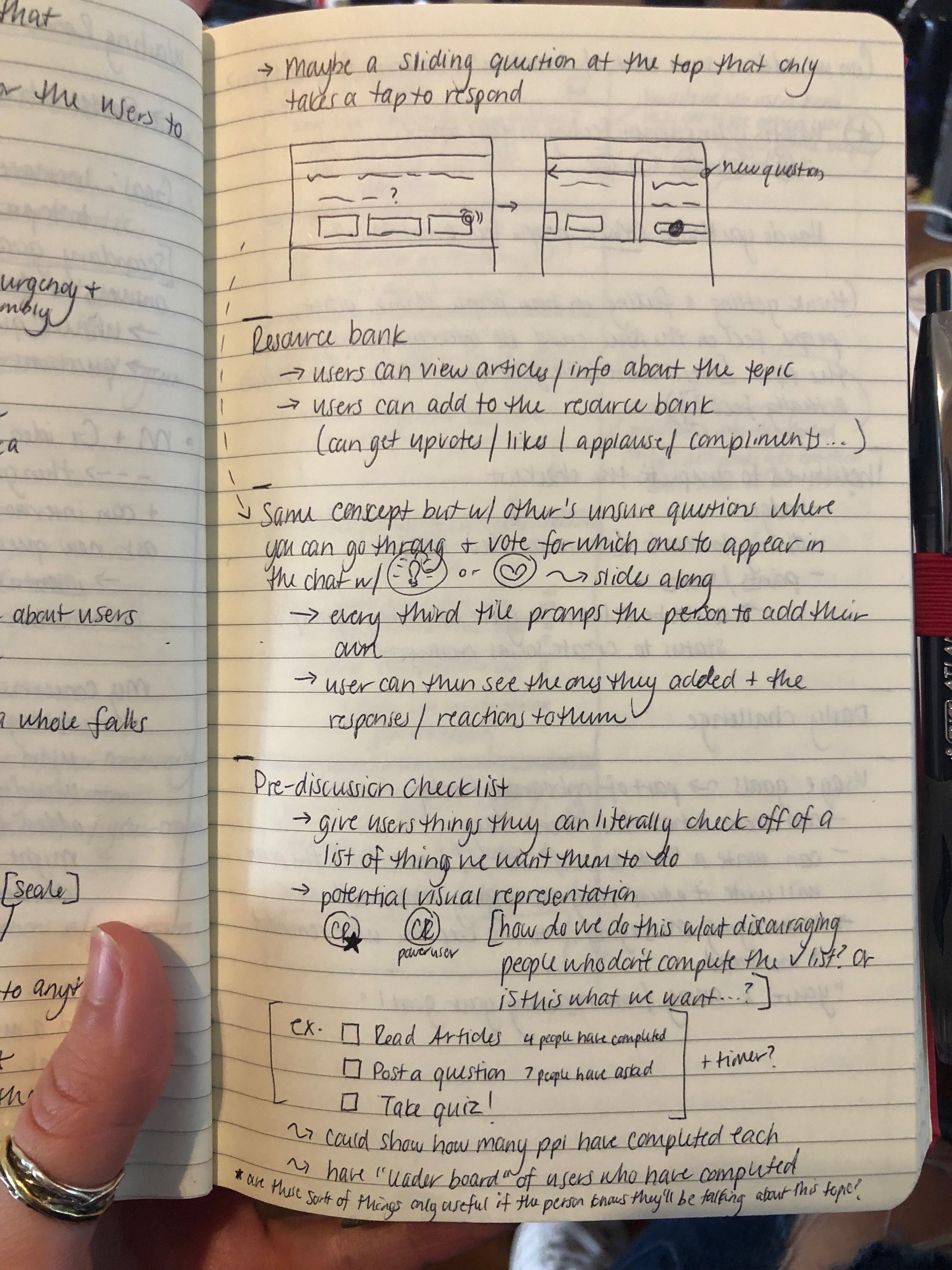
Resource bank
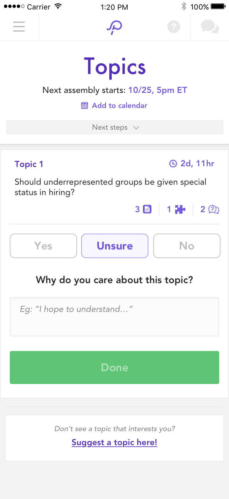
After testing each idea, we found that helpful resources (articles, etc on the topic) as well as quizzes that drew on the curiosity of others performed the best. After prioritizing the impact vs the effort to implement, we decided to first prioritize what we came to call “helpful links”, as the impact was high with a minimal amount of engineering required.
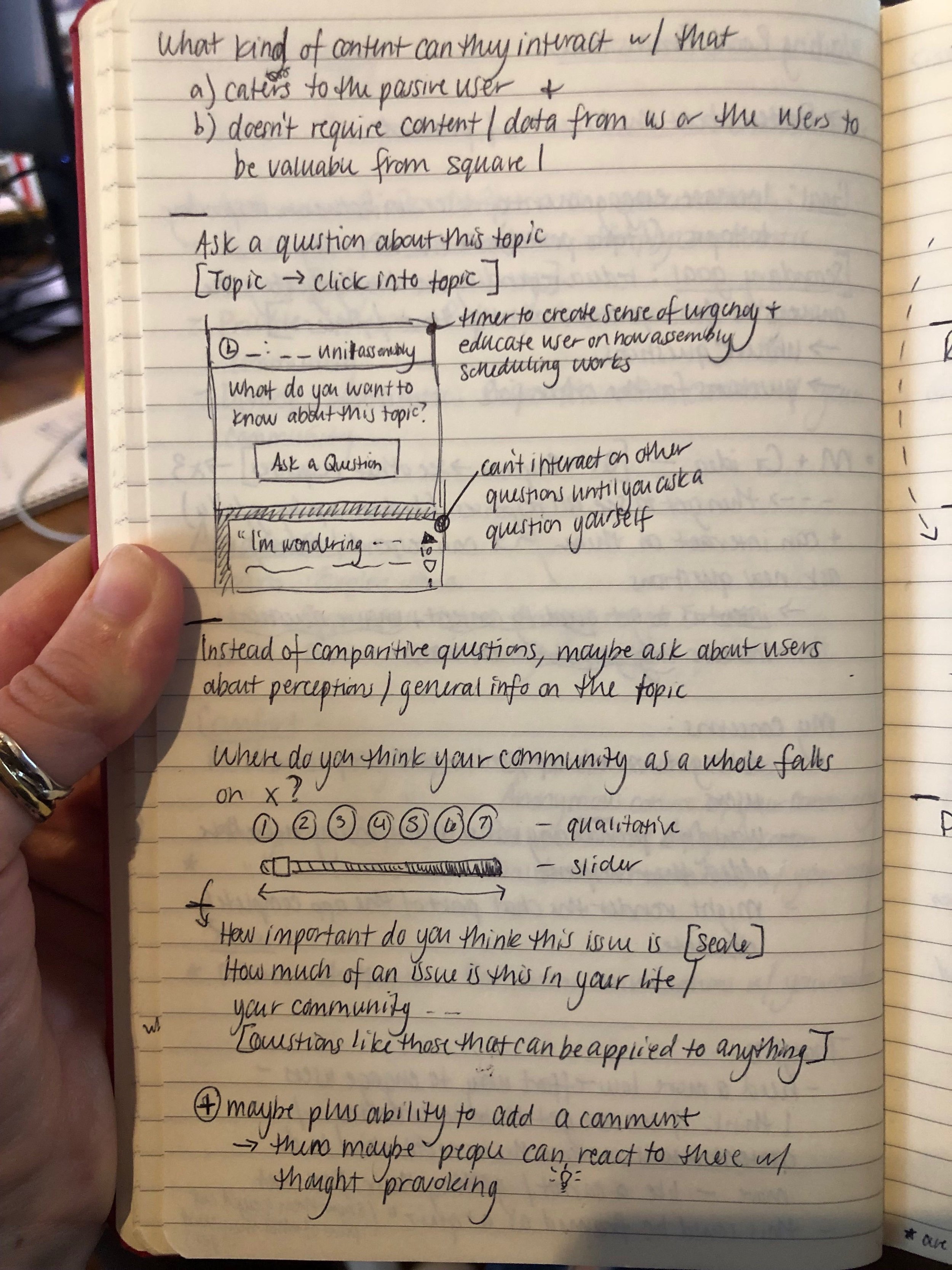
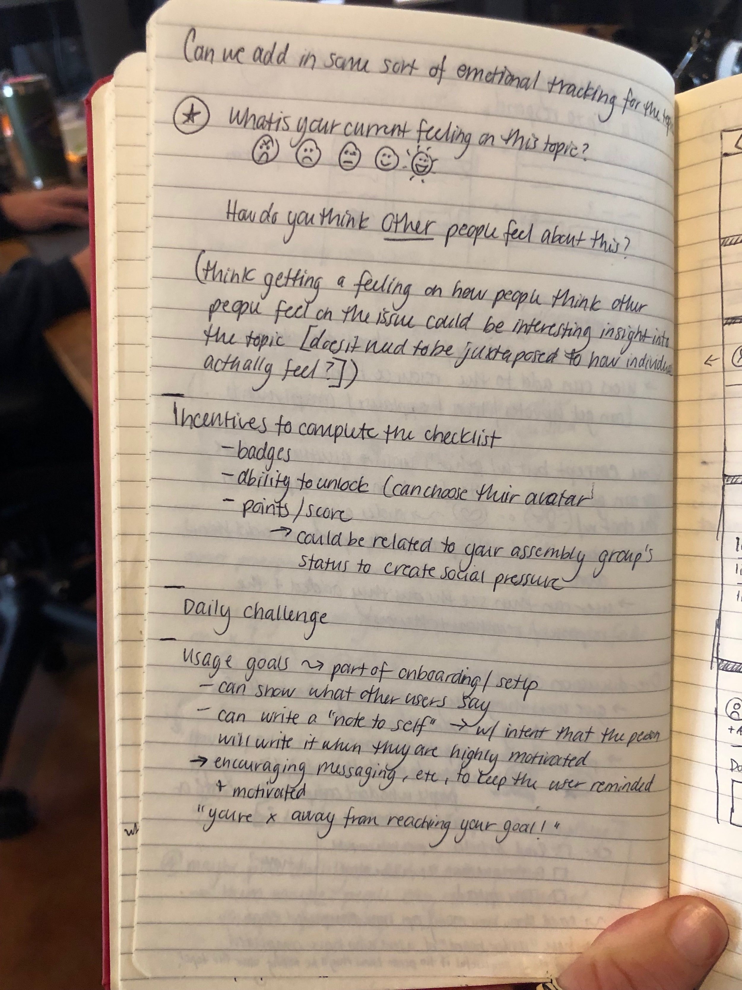
While quizzes performed well, the effort was too large to take on. Instead, we had the idea to draw on the curiosity part of the quizzes that did so well by displaying user responses to “what about this topic are you still unsure about?” and “why you care”. We hoped these would ignite curiosity and help users think more deeply about the topic.
Prototypes
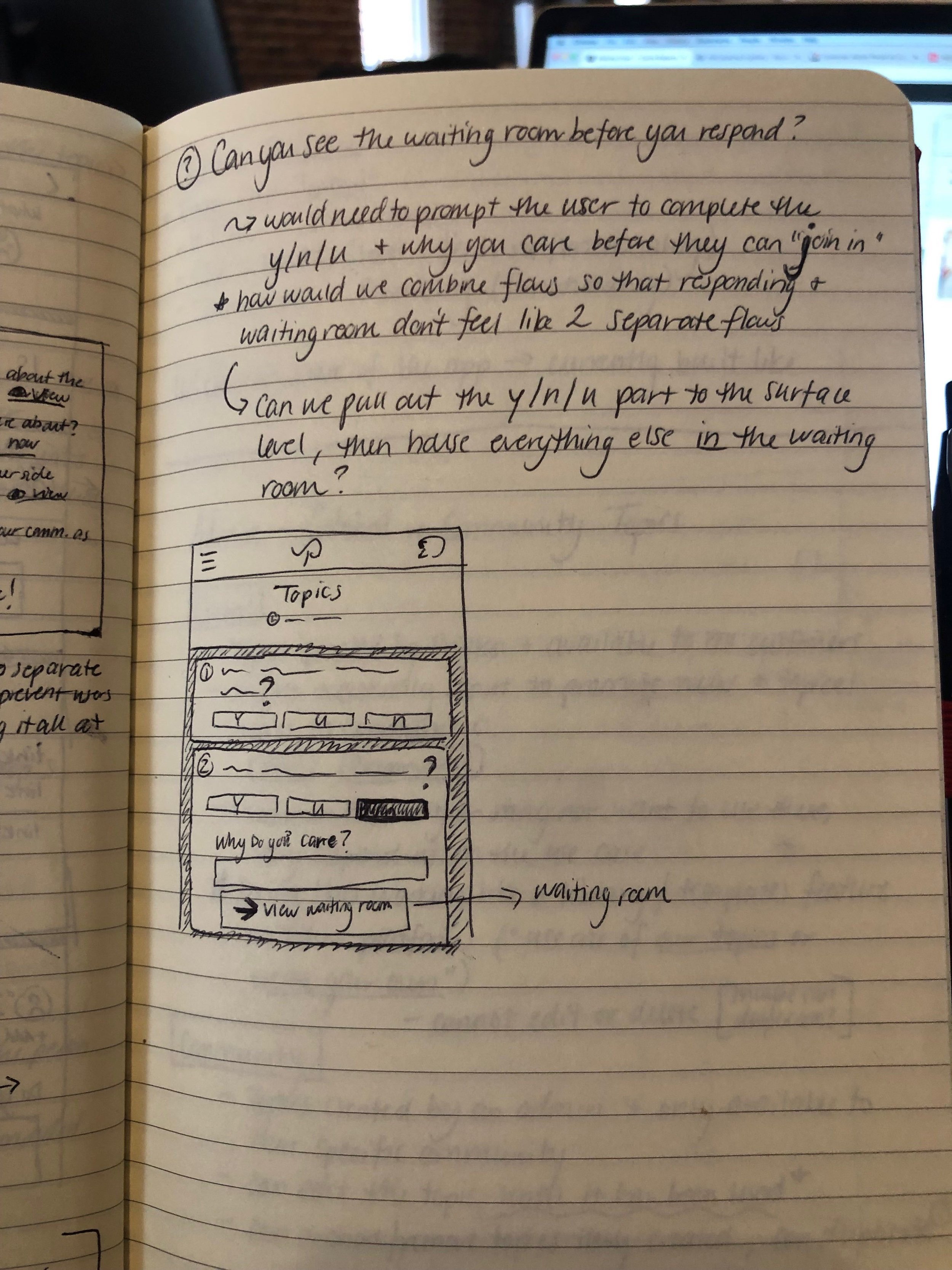
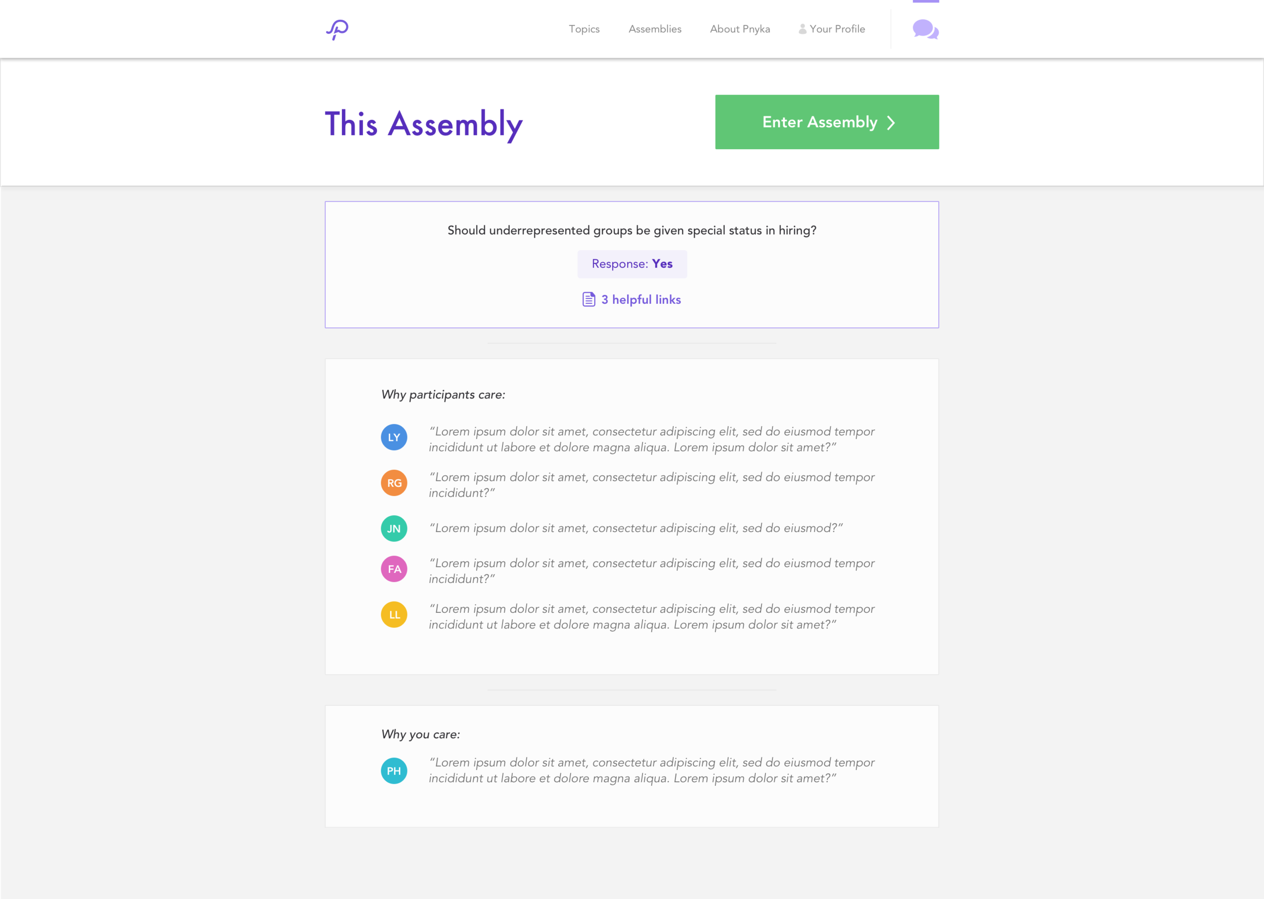
After playing around with everything, I realized that having a separate “waiting room” might not be the best idea. For one, because our app spanned both mobile and desktop, navigating to a new page could be confusing for older users that didn’t understand how they got there. Additionally, because these new elements were heavily reliant on user generated content, the experience would be pretty bad for the first few users. Coming into a basically empty page? That’s certainly not ideal.
To address this, I decided to break these aspects up into individual buttons that opened into their own modals. This made us able to keep everything on the same page, while also removing the bad experience of seeing nothing when no information was there - the element simply would not show up until content was generated.
Wireframes
Sketchin
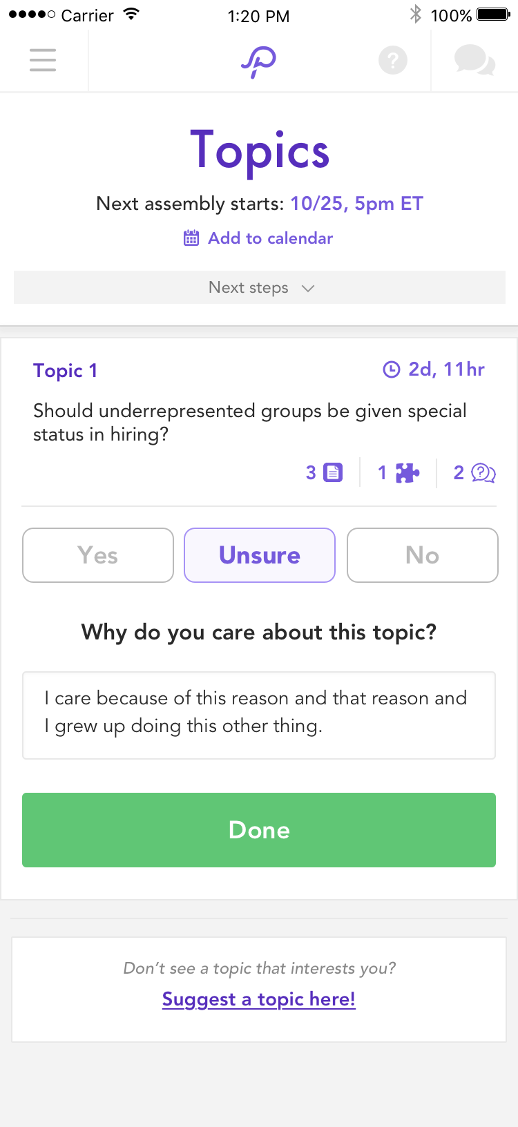
MVP Designs
Once we had completed user testing on the icon options I had come up with to represent each section, I finalized the designs. The result ended up being a great decision—adding the icons across the platform required minimal UI work, meaning we could get this new feature set out to our users much more quickly than anticipated!
Reflection
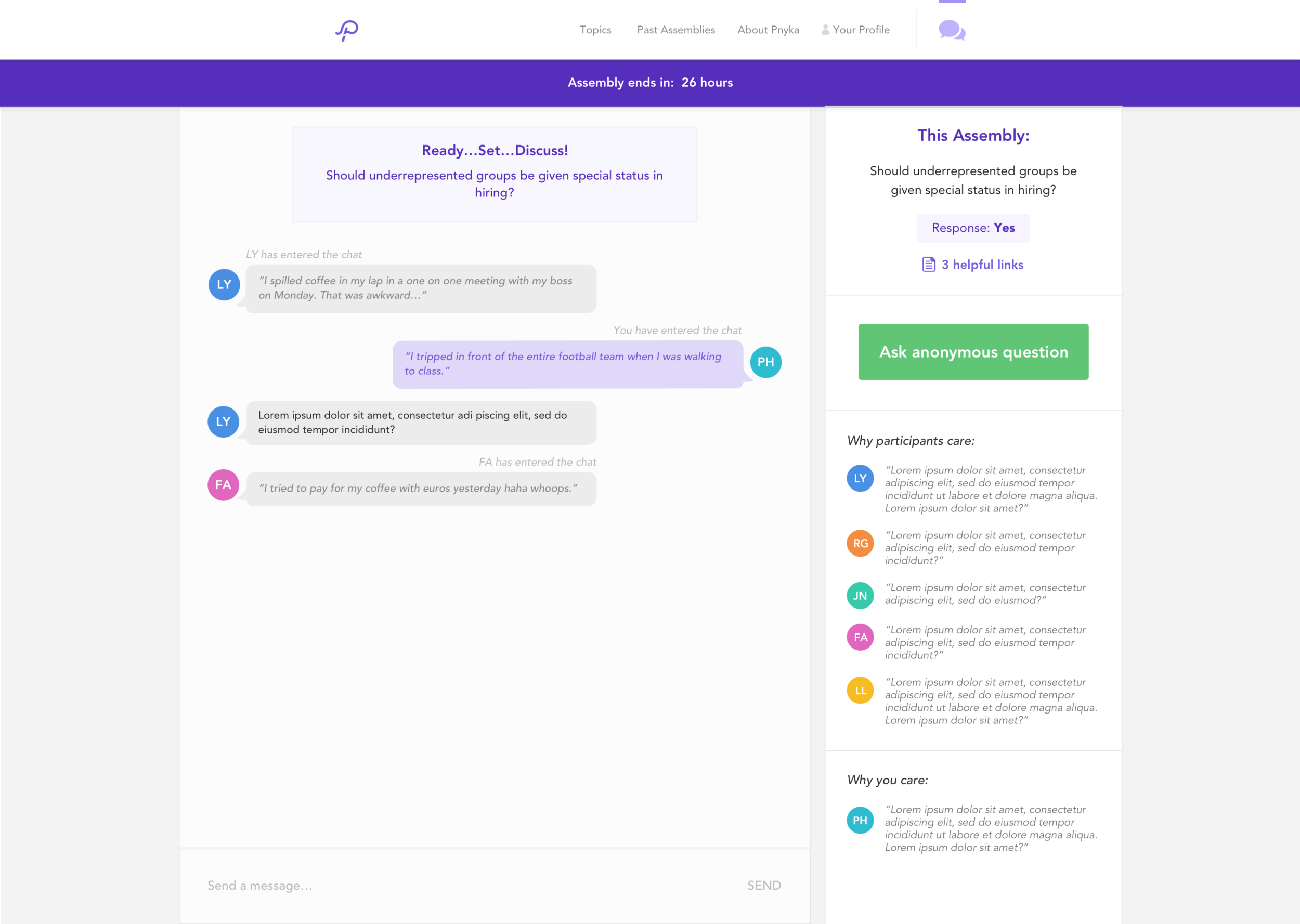
Though we felt good about this new version of the app, there were a few areas where I think we could have done better. Upon early user testing, we found that displaying the “Why users care” responses had the opposite effect we had hoped for in some situations. When a community was heavily on one side of an issue, reading the why you cares would dissuade those of differing opinions. Because of this finding, we removed this tile until we did more research into how to prevent this from happening.
Another aspect I was concerned with was that the interface started to become quite cluttered. Was everything on the UI still needed? Were users using all of these features that had been grandfathered into this new version? I think we could have done a more thorough job doing an audit of the current features.
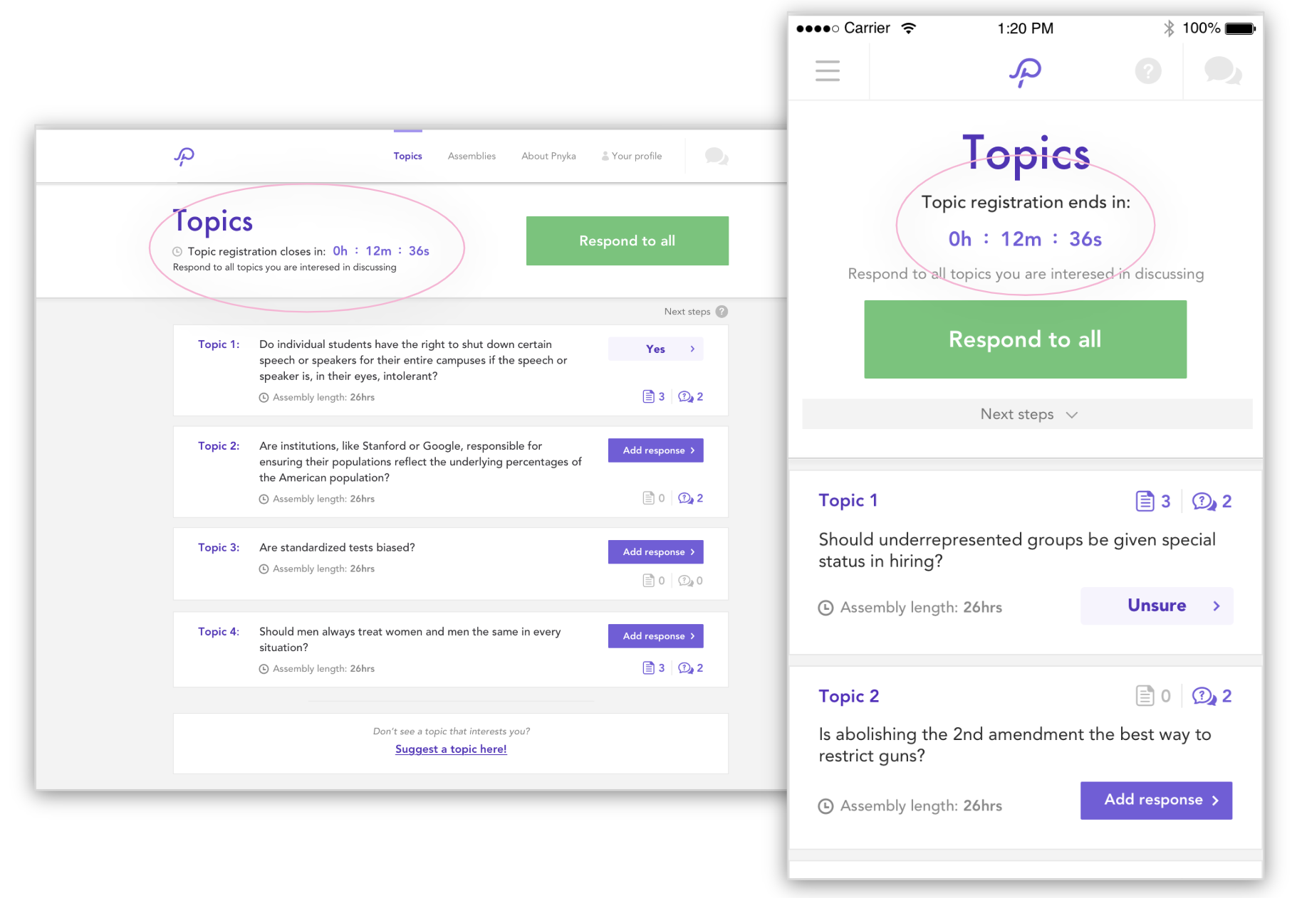
Lastly, I think we could have improved was the user’s sense of time on the app — helping them more easily understand which parts are happening now, which are happening in the future, and were to find their activity from the past. Uncovering this pain point let us to test, prototype, and implement countdown clocks to help the user instantly understand which point of the process they were in.